British Film Institute
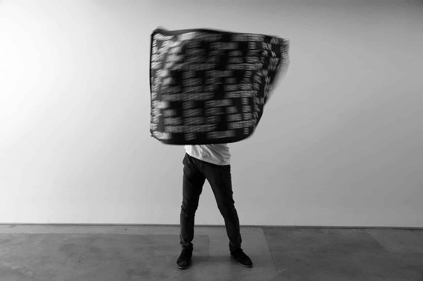
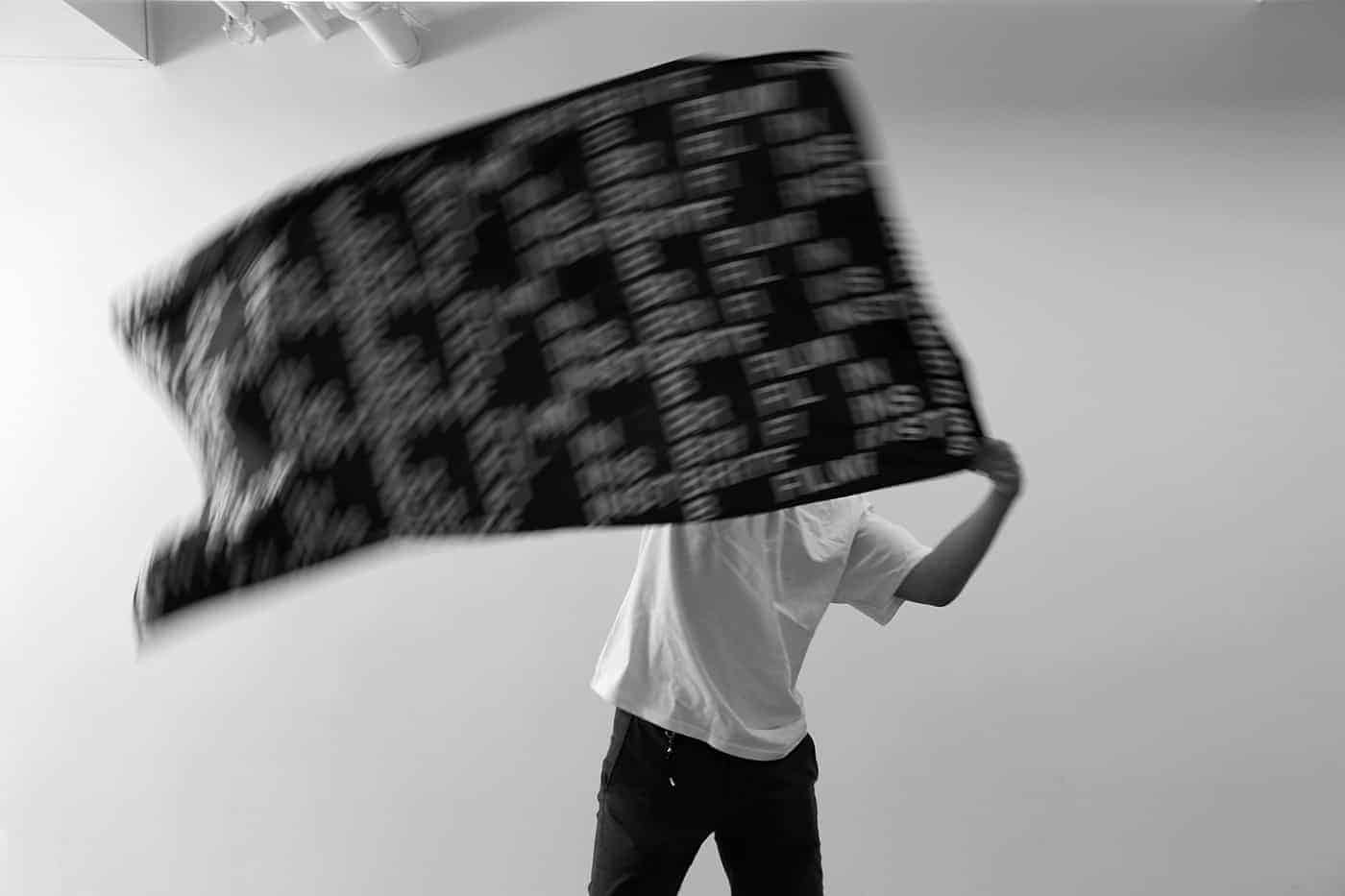
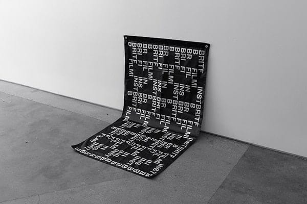
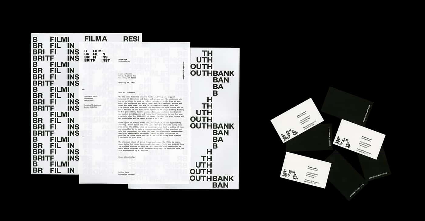
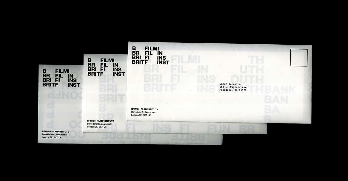
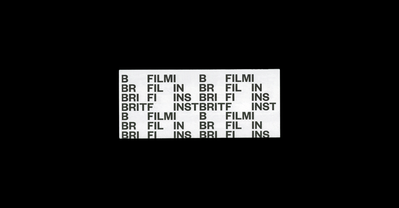
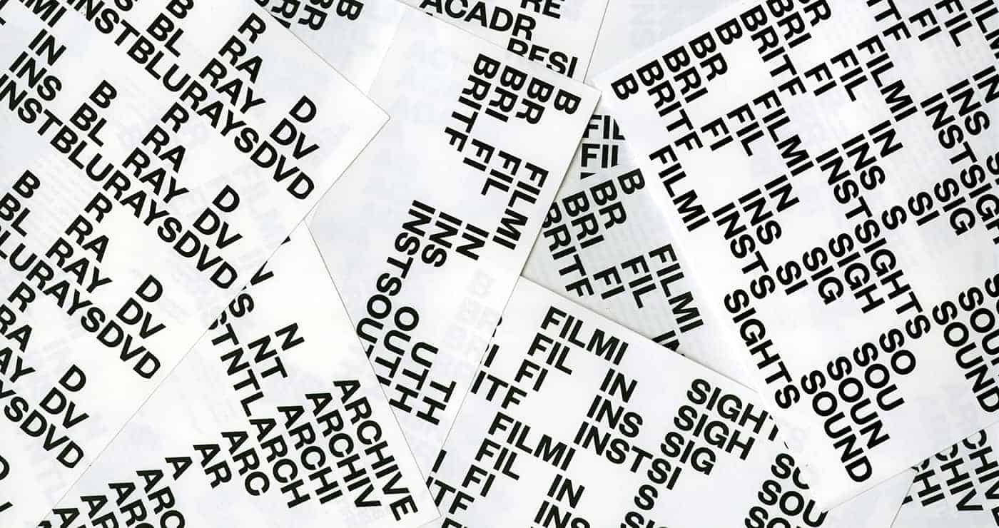
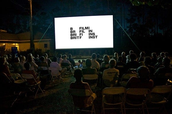
I've created a visual identity that embraces adaptability over corporate consistency. This typographic identity mainly utilizing the idea of repetition, movement, and flexibility. Although there is a primary logo/word mark, it isn't static due to its advantage of versatility. There is a system in which each character of the word "BRIT", "FILM", "INST" move to a different position according to the specific grid, format, and media it is placed at, and each movement ultimately creates an interesting and unique form which reflects the overall idea of flow of the plot charts.

I extensively researched the history and the origin of cinematography and was heavily inspired by the concept of "Pure Cinema"-- the assembly of film, and how different orientations of films can create different ideas. One great example of it is a technique called The Kuleshov Effect. I was fascinated how simply juxtaposing images with different & repetitive images could directly and easily manipulate the audience's emotional experience. That is the reason why I utilized the repetition of time to reflect that idea.
What differs from cinematography and photography is that cinematography incorporates and utilizes movement rather than a still image. Movement is an essential element in cinematography which creates flow and dynamics in film. I was also fascinated at the fact that every movie/film has its own unique storyline and narrative. After researching, I was inspired by the various flow of story maps and how dynamic, flexible, and different they are.
I did not want the identity to be static but also not chaotic, therefore, I restricted the identity with a specific grid system. This same approach could be applied into different departments such as National Archive, Southbank, Film Fund and many more. It is also applied and used for apps, posters, and other mediums managed by British Film Institute. The institutional posters and other applications are interactive and informative in which people can interact and have new emotional experience yet also be informed about the core value of the institution.
I used Adobe Photoshop, Illustrator, Indesign, and After Effects. I initially used illustrator to make different variations of the logo, and after refining and finalizing the logo, I directly moved on to Indesign to create all stationaries such as letter heads, business cards, envelope, websites, and etc. I, then, moved on to After Effects to create motion pieces for my logo mark to demonstrate the dynamics of this identity and to show the overall idea, concept, and approach to my design. Lastly, I used Photoshop to do some image treatments and to create some mock ups to see how the logo lives in the environment.

After I posted the project on Behance, I have been getting a lot of great comments from people all over the world which really motivated me to do better for the next upcoming projects. It was really nice to know that there are a lot of people out there who really appreciate my work. Besides the technical skills, I think I really learned a lot about typography in general since I had to deal with an identity that heavily deals with type. I also learned that people really appreciate the process, concept/idea, and presentation.
This is really nice, it's very elegant!