Casa Cardona Wines

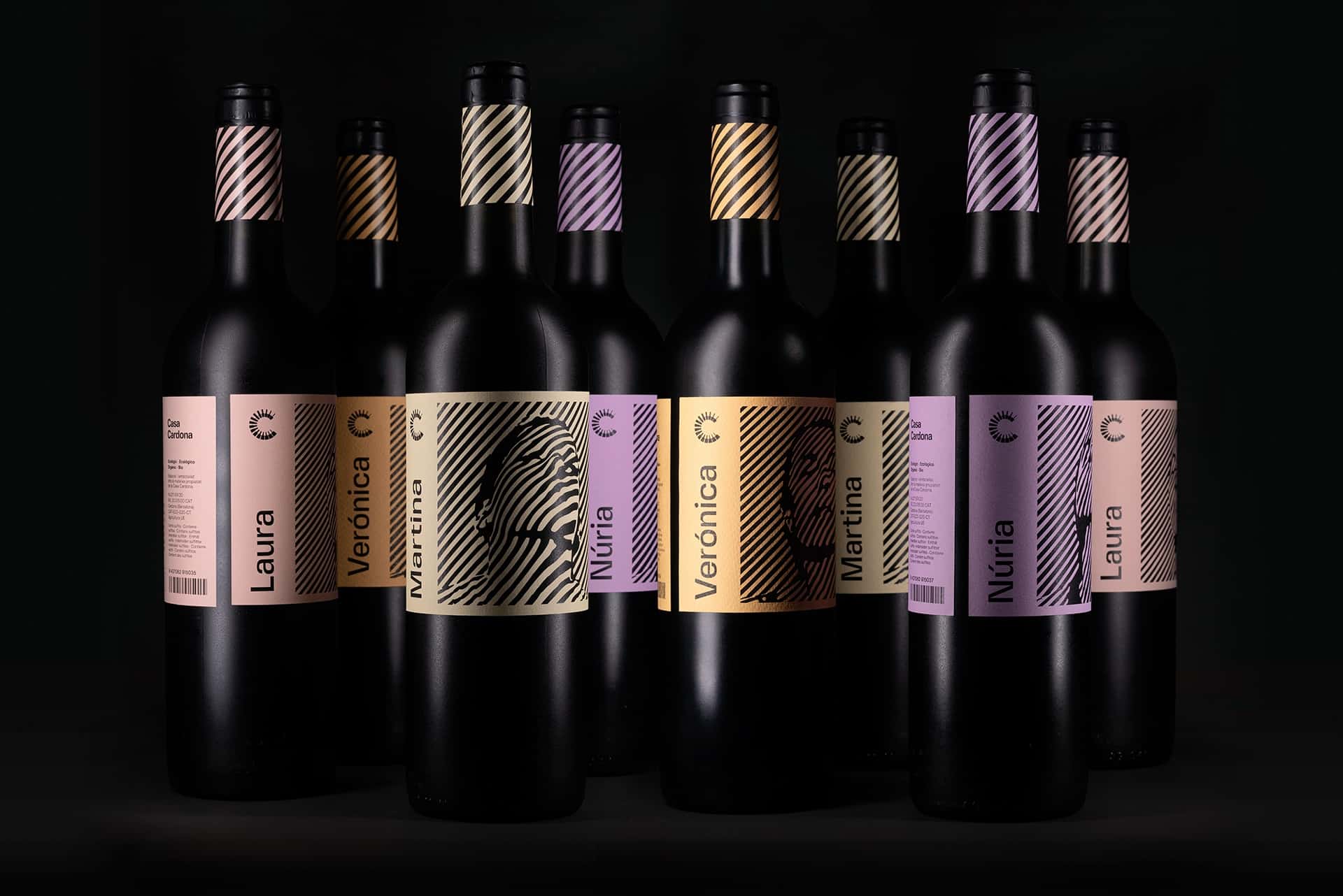
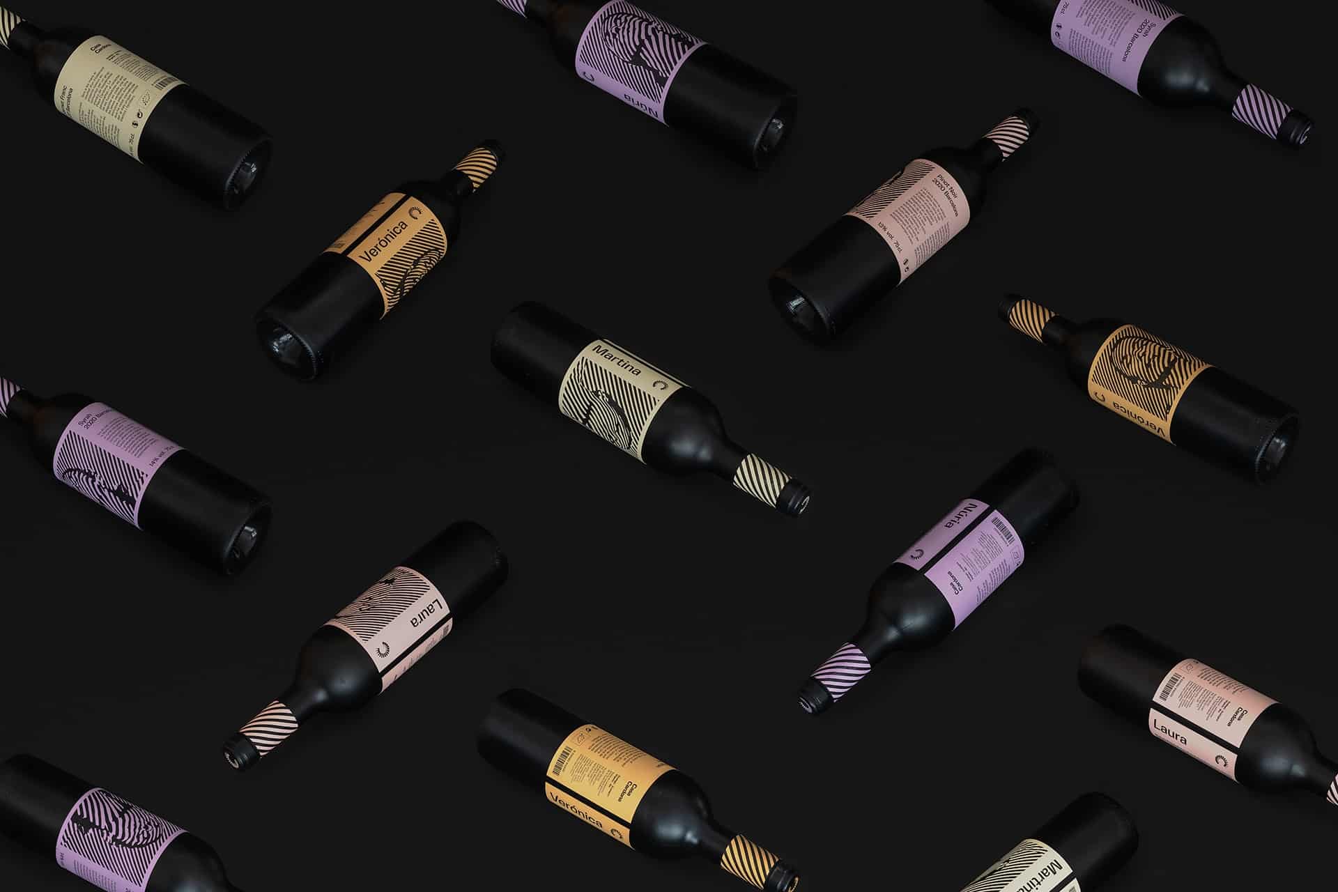
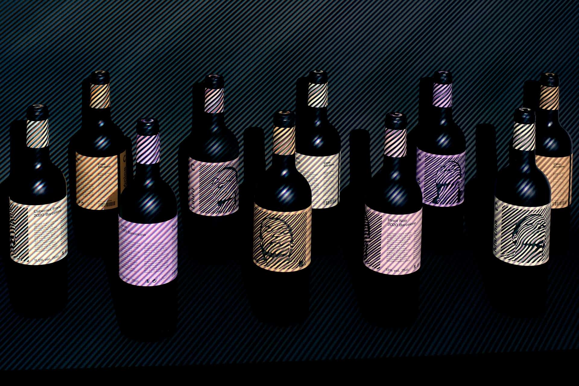
Casa Cardona wines are the culmination of an exciting community-born project by a group of friends from the beautiful Cardona Square, Barcelona. The personality of their female founders can be savoured in each of its varieties.
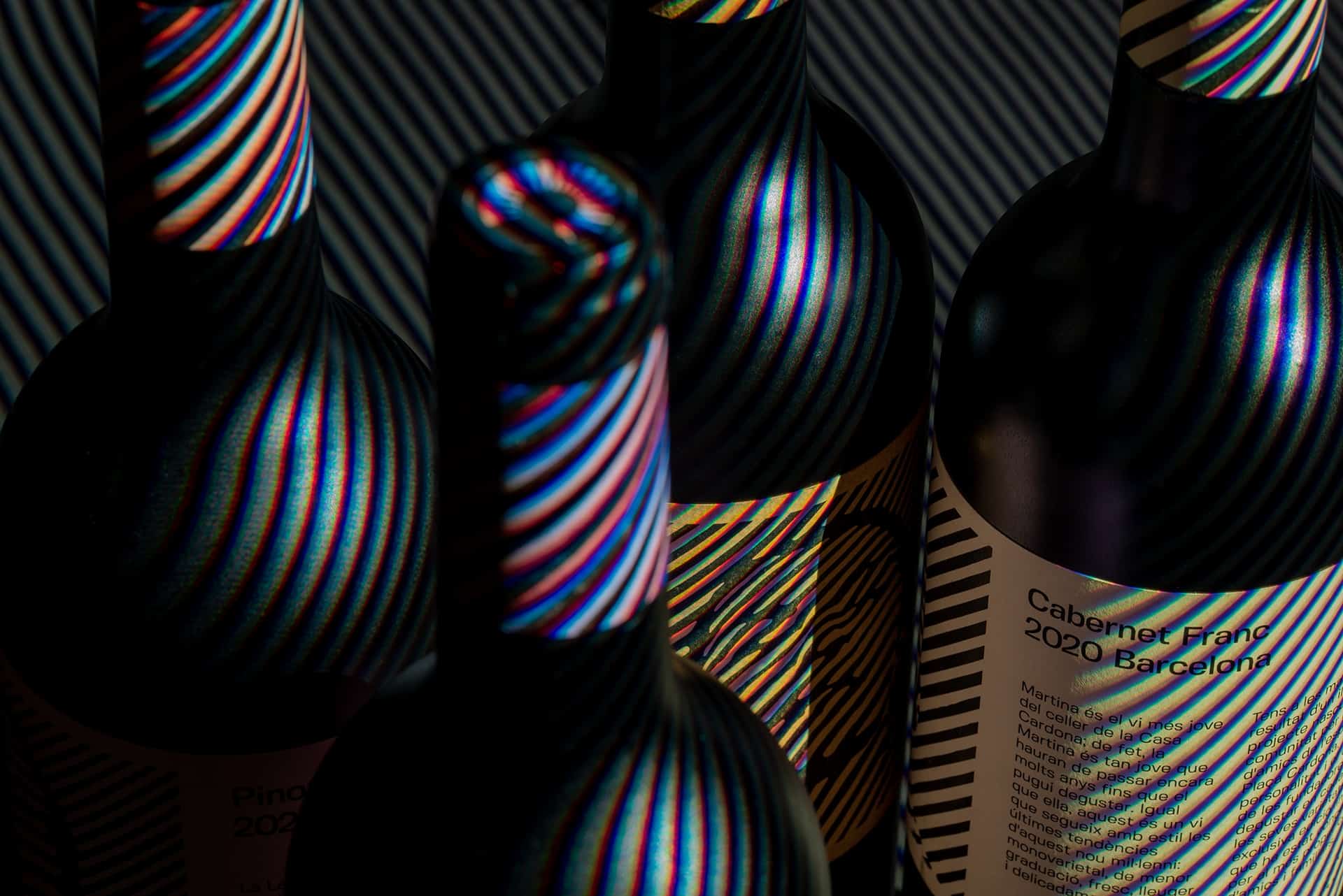
The portraits are the result of a series of lighting experiments focused on illusion and perception, including how to capture depth and motion effects onto two-dimensional surfaces. While the artwork and logotype are genuinely inspired by the 1960s Op-art paintings by Bridget Riley and Victor Vasarely, the choice of Fivo Sans Modern typeface evokes the same period—when Aldo Novarese's Eurostile was widely used.
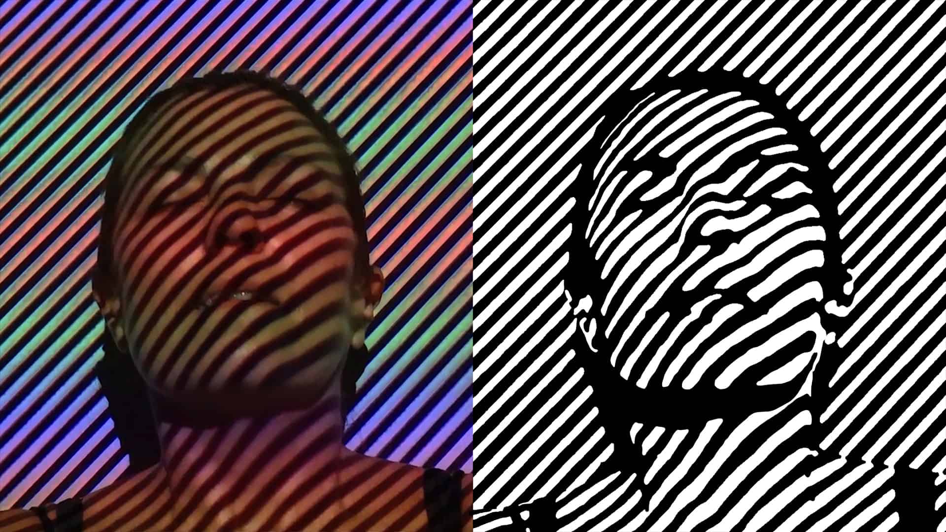
During the conceptual research phase, I realized that in the wine-making process, there is a first outdoors period where bright sunlight is essential for growing grapes. Then comes the second part in the cellar, which in contrast, develops in the absolute darkness where is critical the total absence of light. This duality, almost ambivalence, between light and dark, black and white, evoked me the Op-art. I have always been deeply fascinated by this artistic movement, reaching a new climax by visiting the recent Bridget Riley exhibition at the Hayward Gallery.
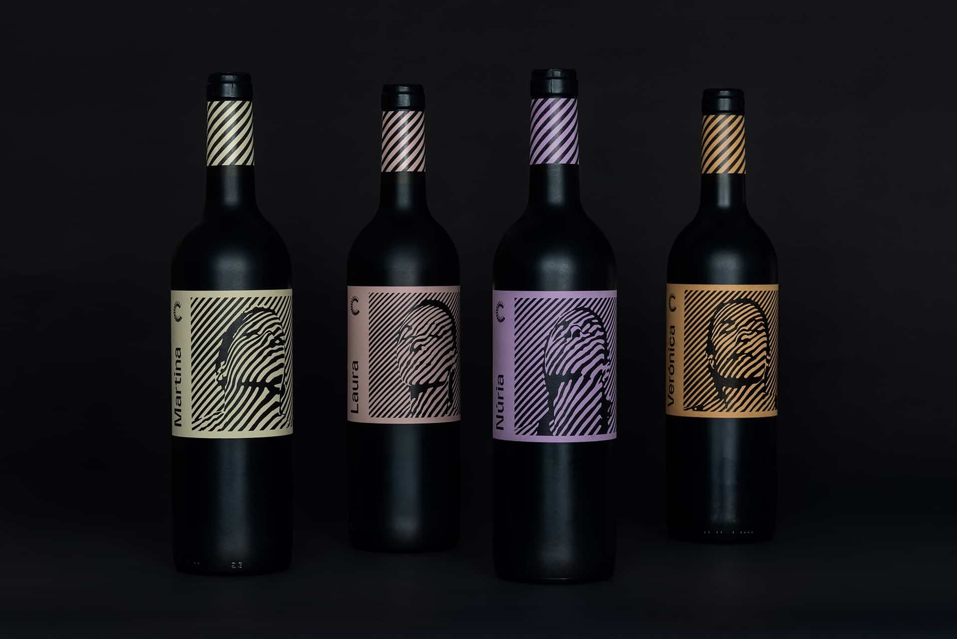
I first created a series of black&white linework backgrounds (vertical, horizontal, circular), and turned them into light using a projector. After several tests, I decided on portraits with diagonal lines as they offer the best balance of definition, depth and aesthetics when projected on them.
Due I shot videos instead of photos, I was able to choose the best snippets from where I extracted the final frames using Premiere Pro, After Effects and Photoshop. I then vectorized in Illustrator the artworks to remove any raster effect and get the sharpest black&white contrast.
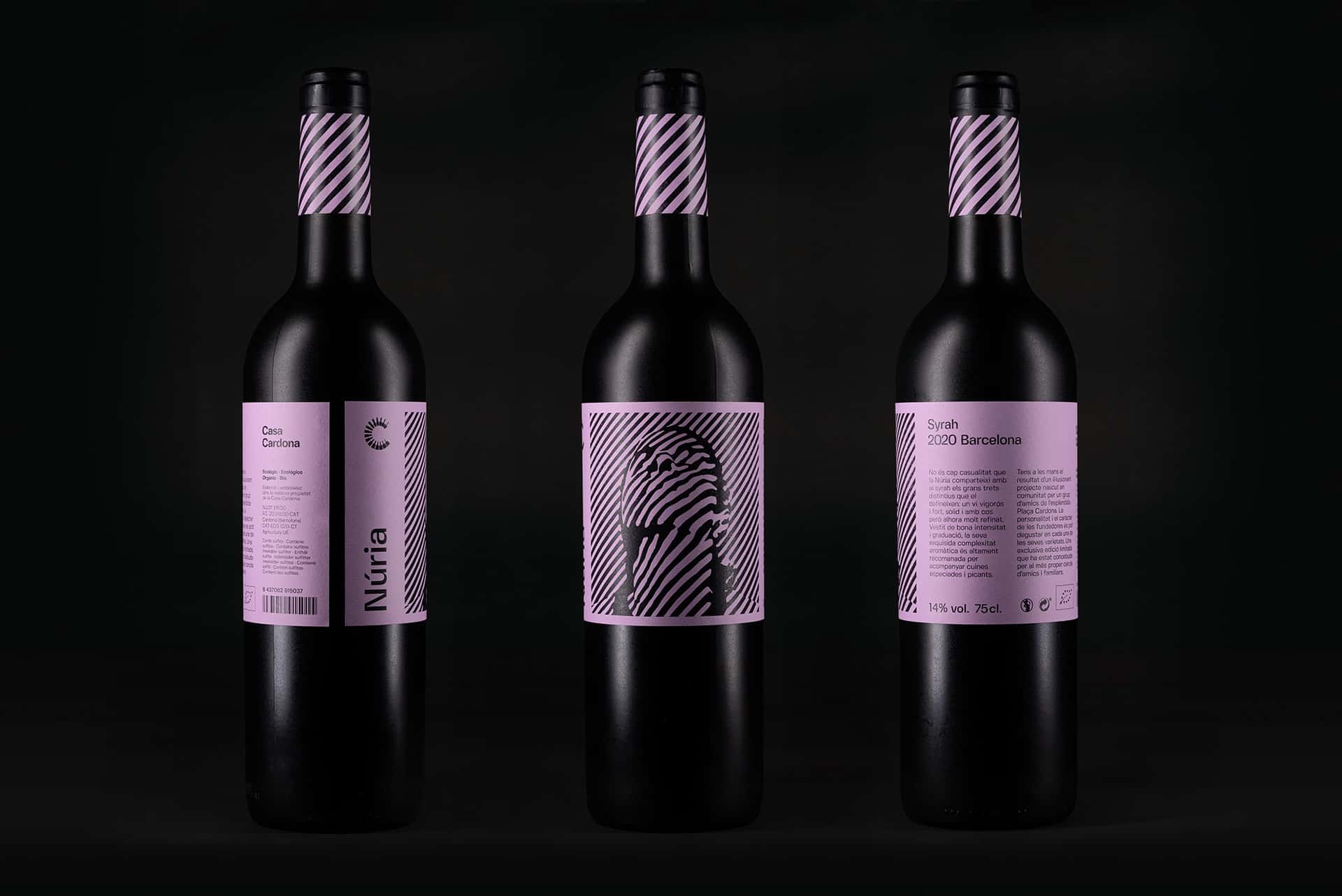
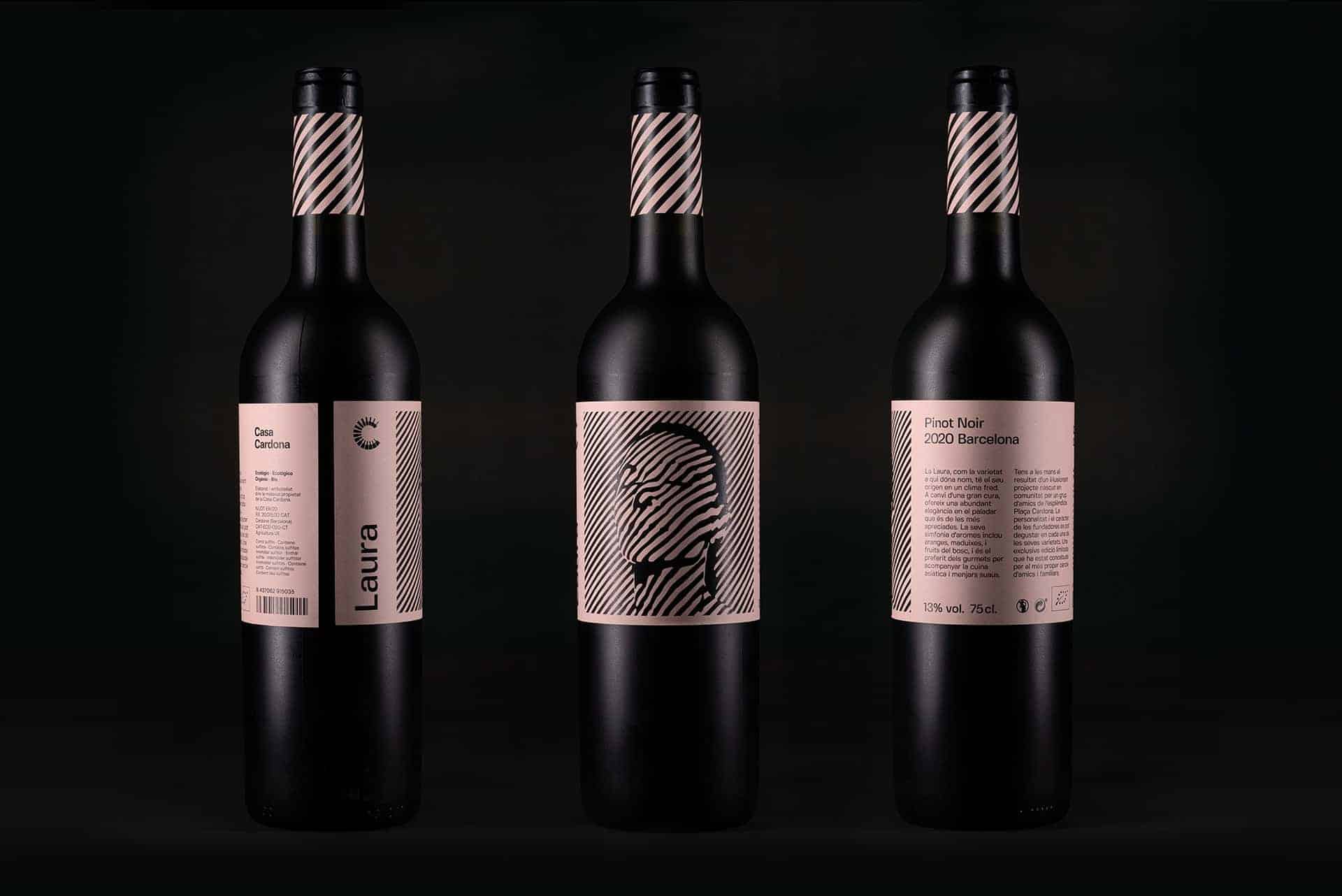
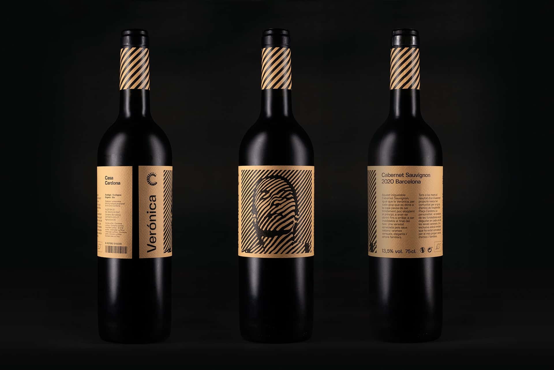
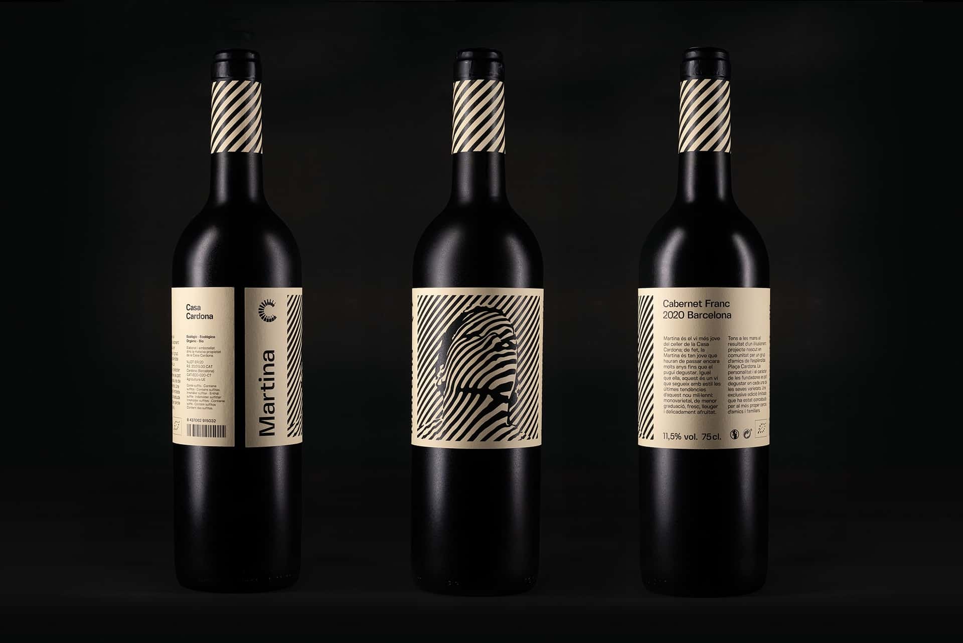
I am satisfied with the modern take of the 60-70s graphic design aesthetics. From the first sight, it communicates that it is a wine with an unusual origin; arouse curiosity and invite to read the description that goes with the label. The packaging works as a statement, instantly telling you that this is an exceptional off-brand wine; few wineries could make such a similar approach.
Today, when I walk into a speciality wine or beer shop, I experience the same feelings as when I visit a design exhibition; all new brands exude tremendous creativity! Therefore, developing a design that is recognizable, unique and memorable is undoubtedly the biggest challenge.
I like the design!
Love this! Really like the design