Green House

Naming, Branding, Art direction & Packaging for Green House. Green House is a new organic beauty company. They make products with natural ingredients, without chemicals, or synthetic ingredients.
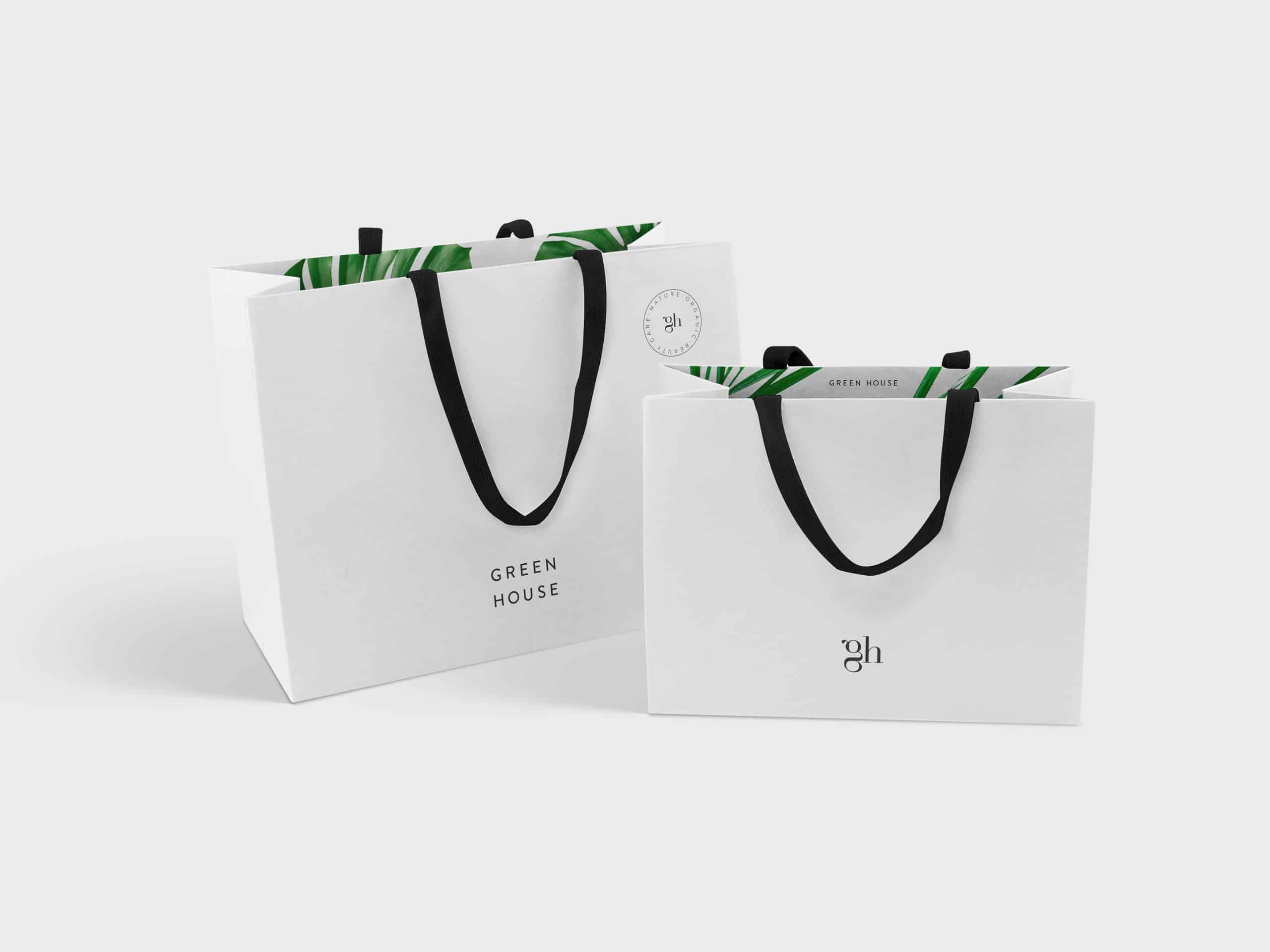
So they wanted to show this natural character in the name and the packaging style.
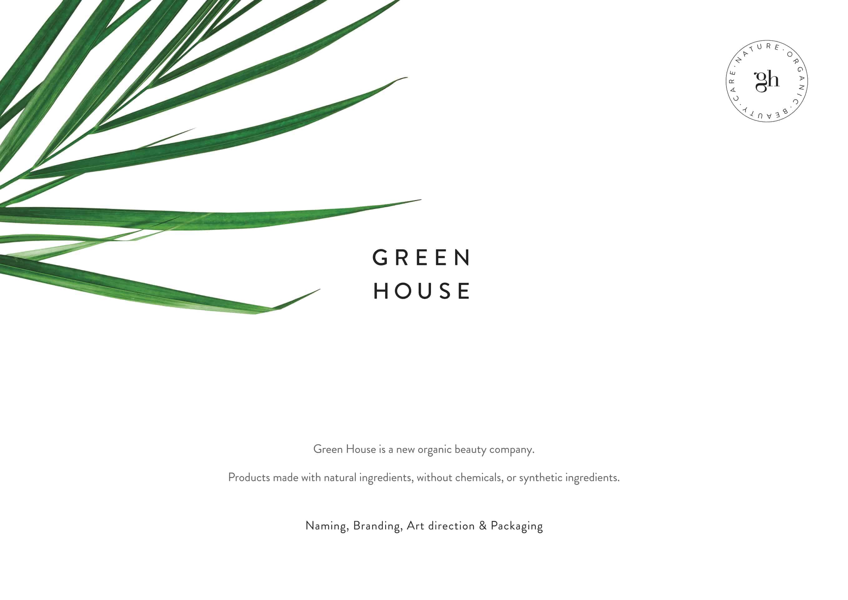
The brand needed to show it's natural character.
Talking about the name, I suggest Green House, because it has everything they wanted to reflect.
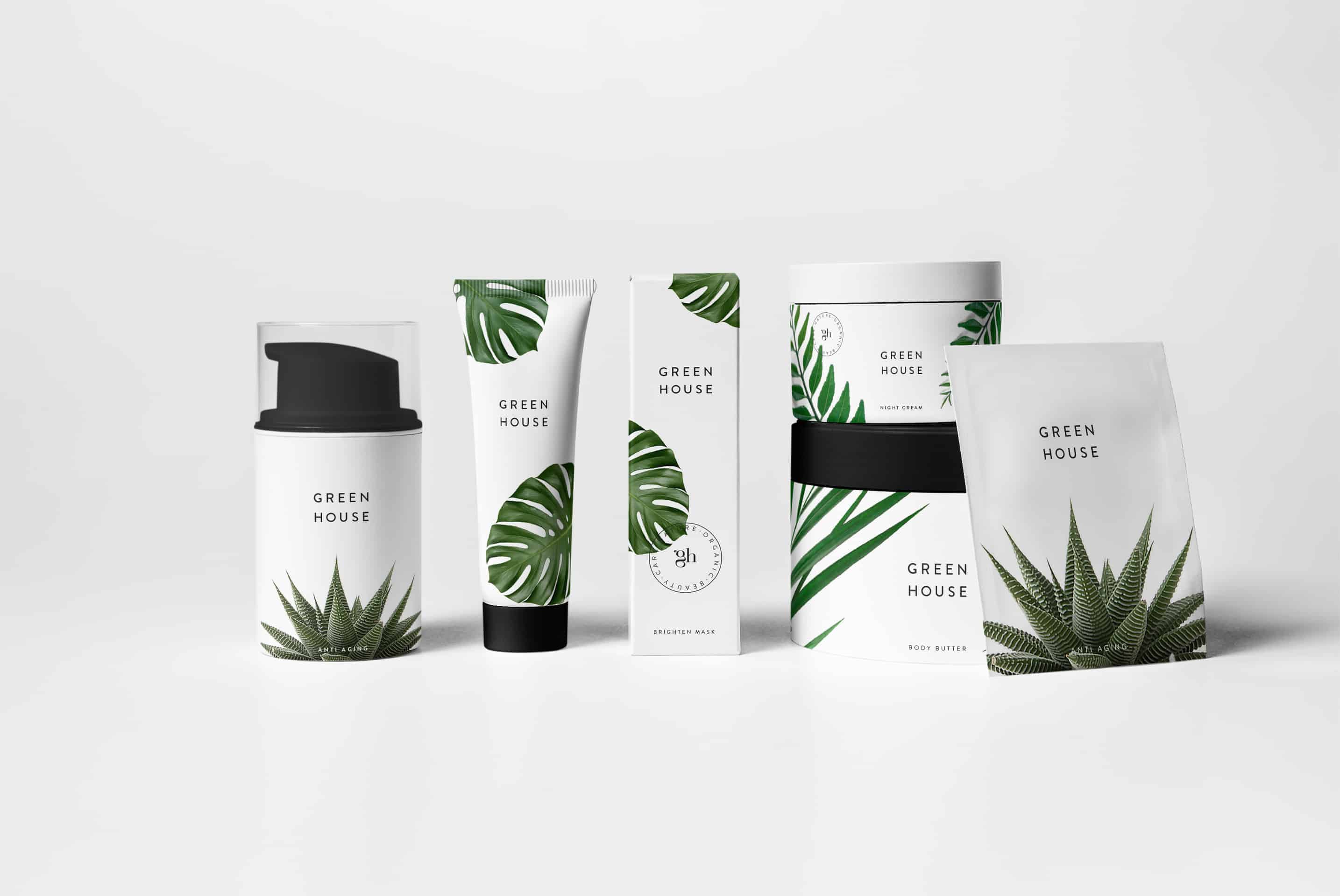
In other hand, I decided to make the graphic design very clean and add plants like the powerful image of the brand.
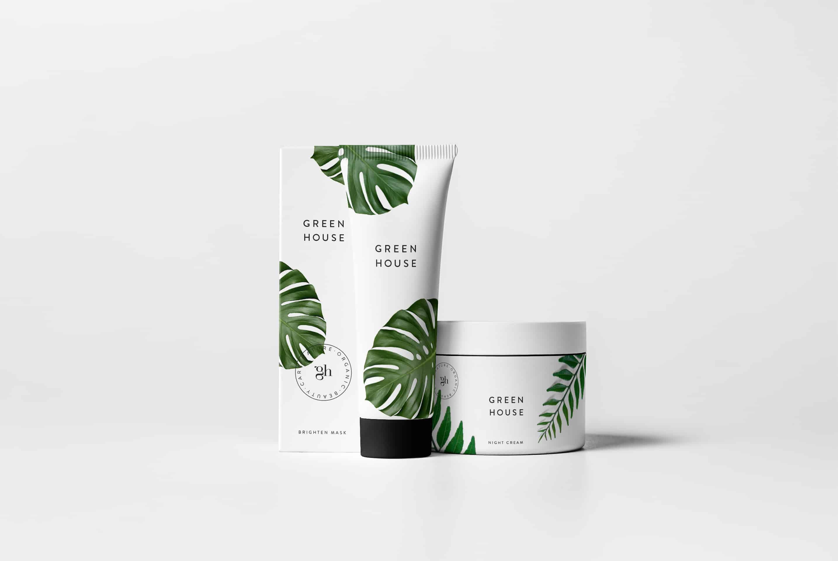
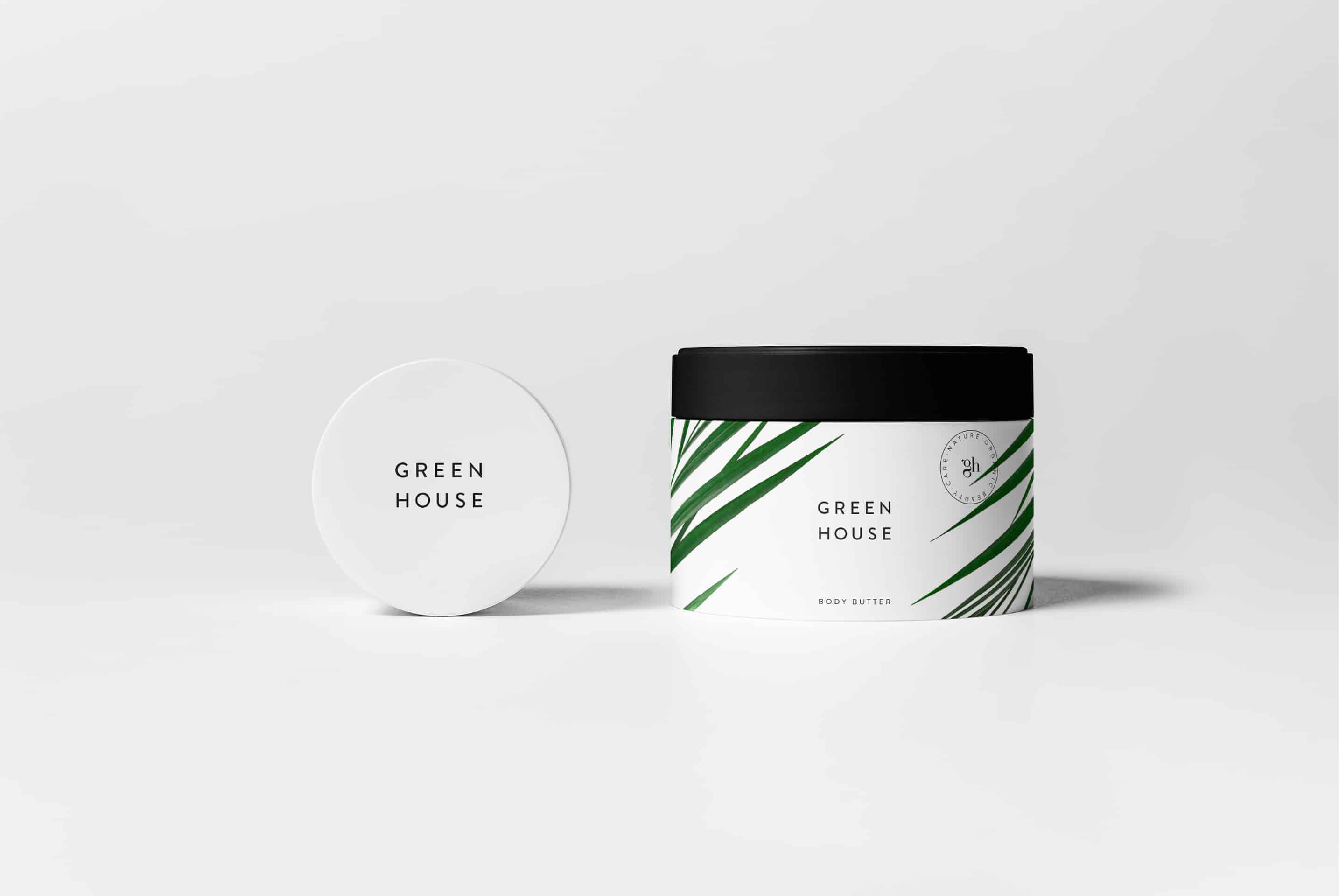
I design it using my camera to take some plants pictures, packaging pictures, etc.
Also I have used photoshop, to edit these pictures, and the presentation images.
The other software is Illustrator, which I used to design the graphics, (logo, stamp, etc)
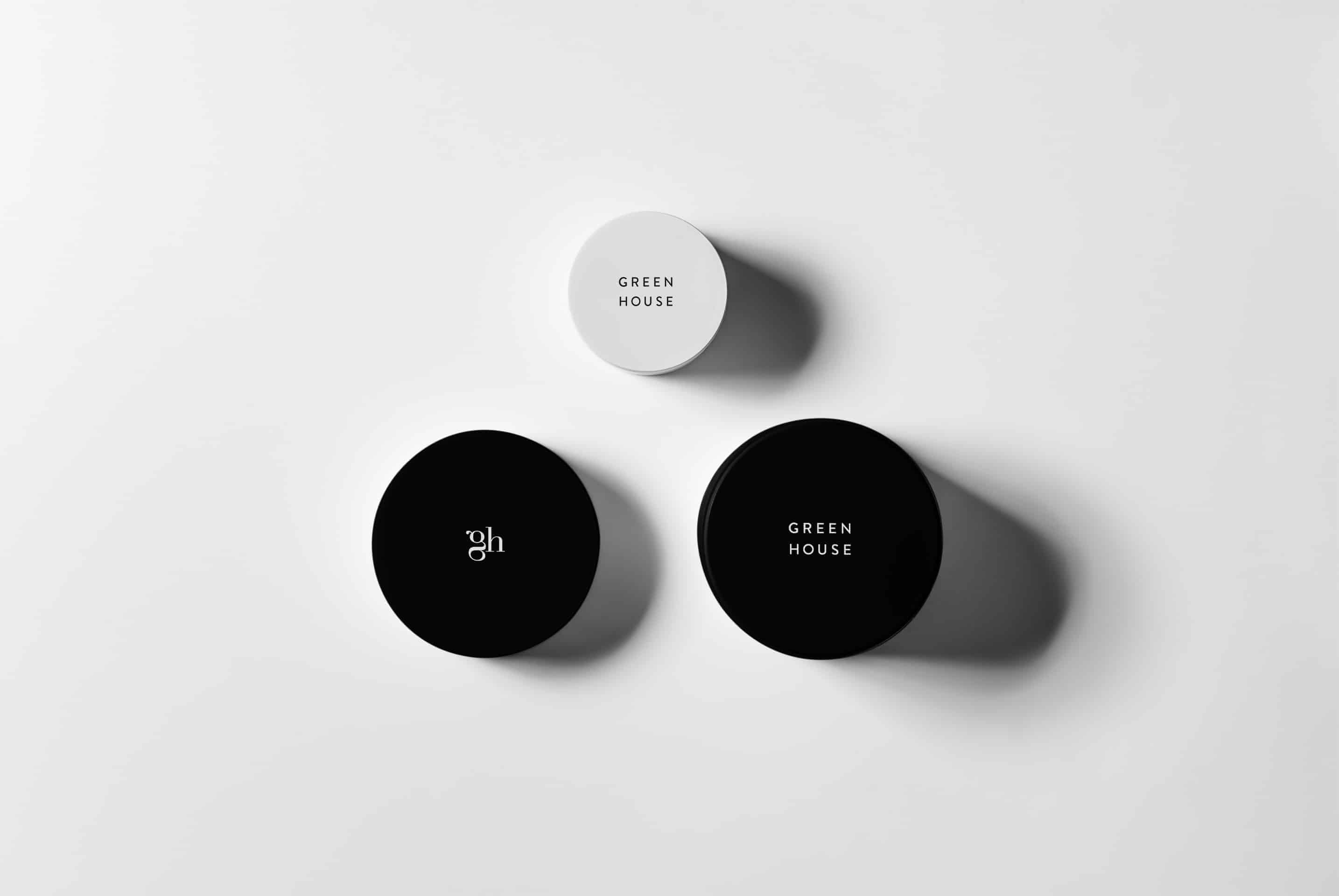
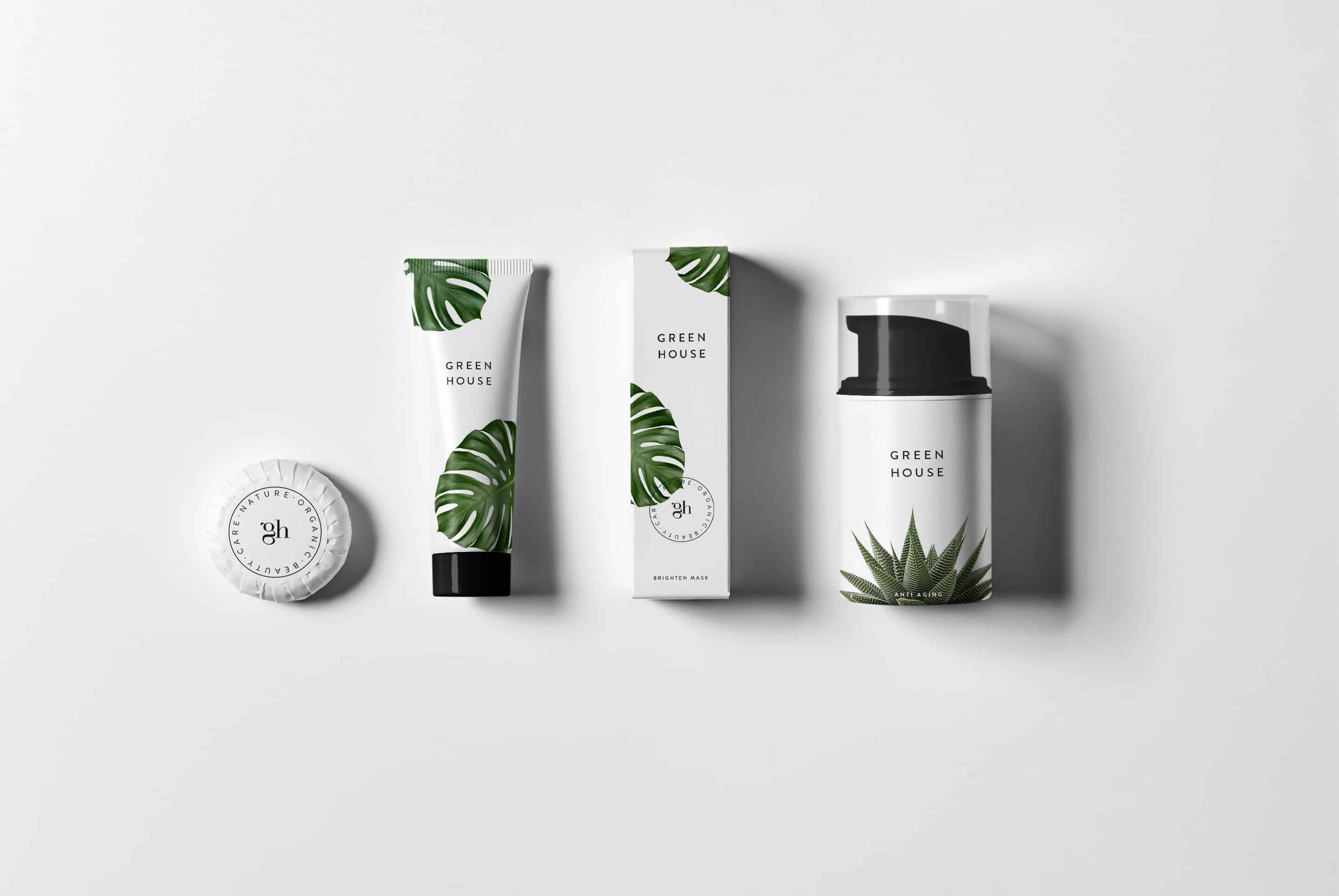
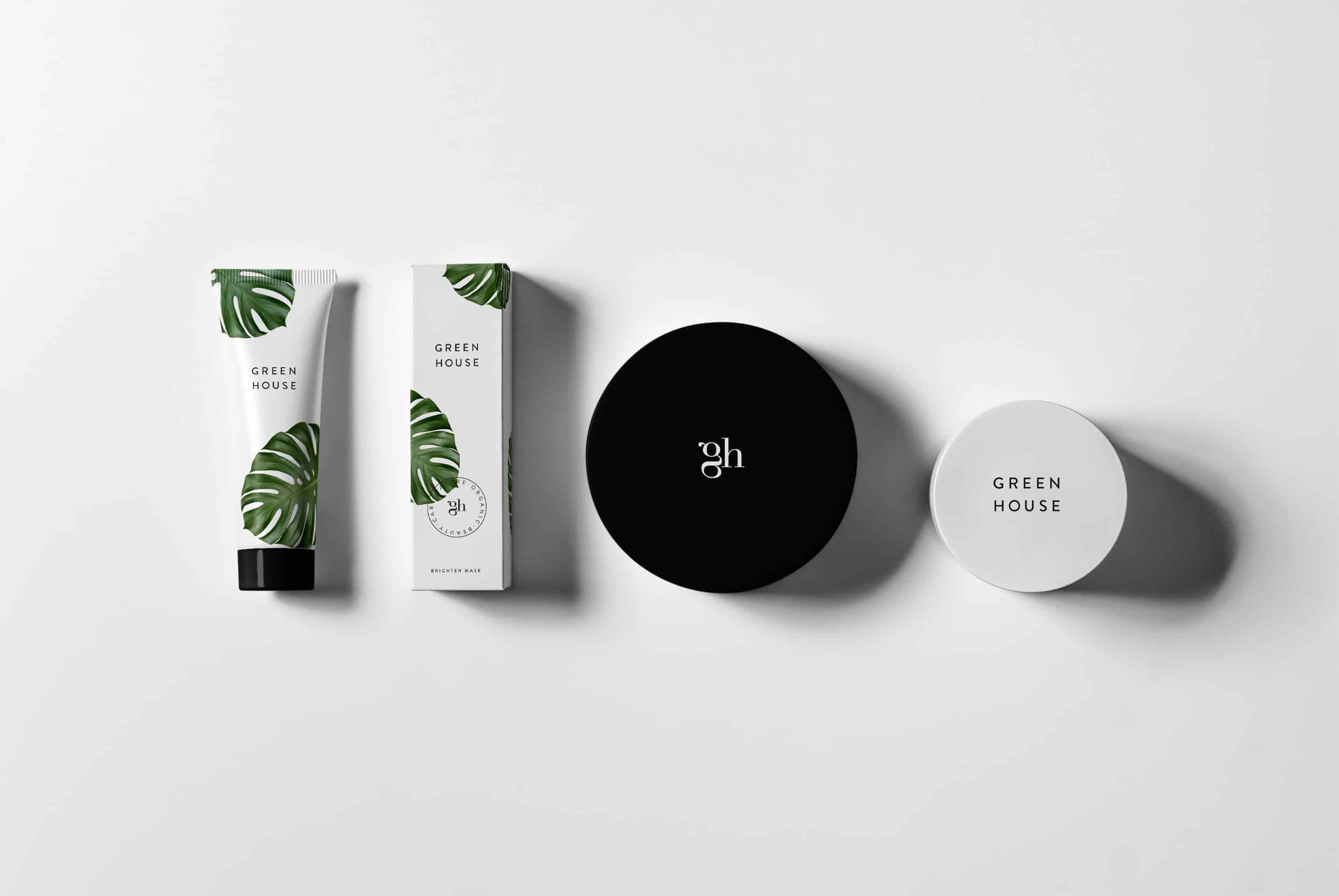
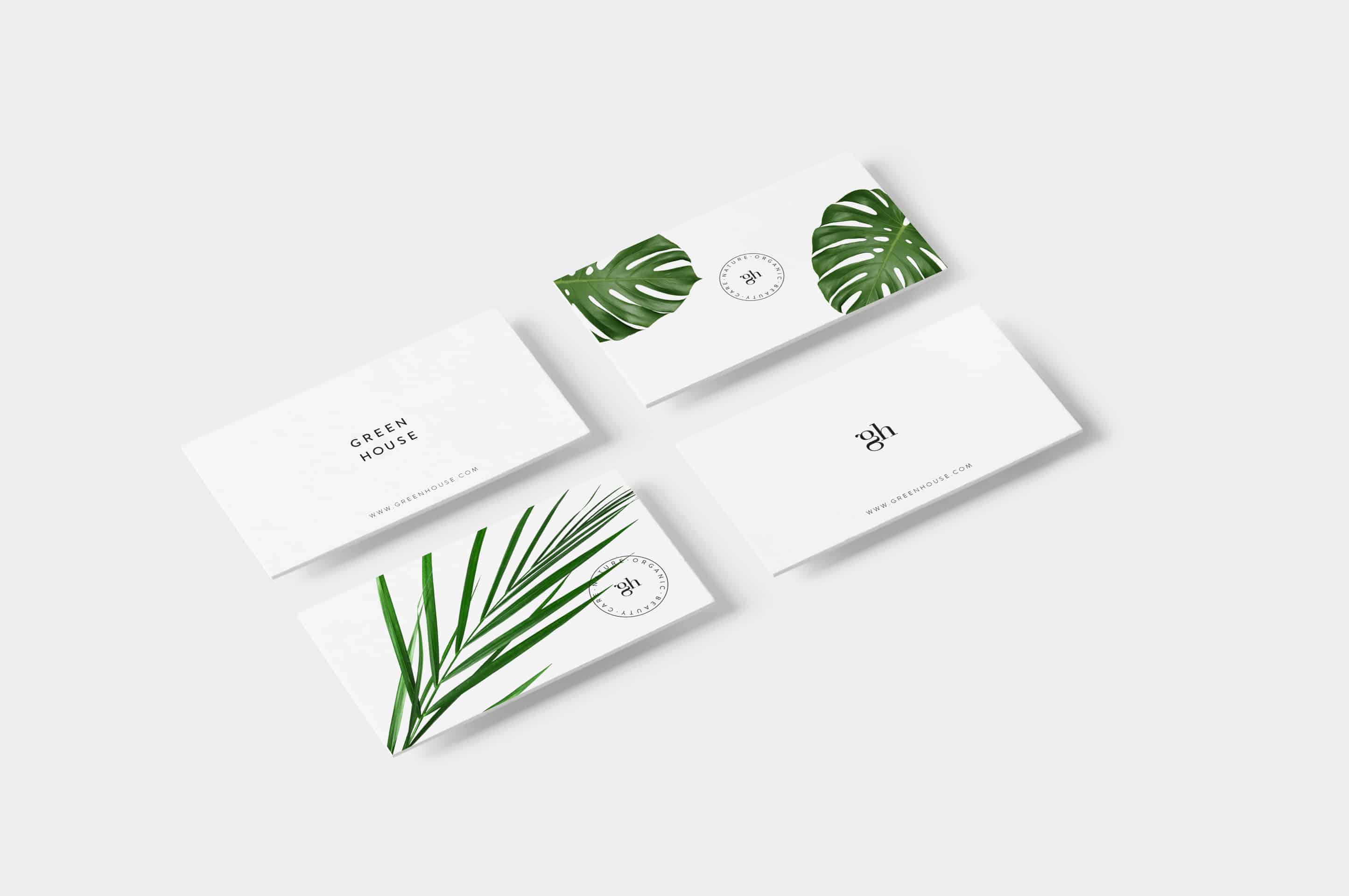
With this project I have learned that simplicity could be the best element in a design.
People like this simplicity, the use of the type, and the combination of the plants images with the graphics.
Also people like the bags with the printed inner.