GS40 - Education Portal Branding

GS40 is an Educational Development Company - Founder creates courses for students with a spirit of innovation. In addition to online textbooks, GS40 also provides students with new learning methods based on experience and curriculum in Europe and the US. They believe this Start Up will bring new and useful learning experiences to Vietnamese with different design style compares to others and more colorful for students.
After receiving the brief and exchanging carefully with the customer. I realize this is a project that needs to bring what is clearly suggestive of the brand to the audience but still need to be neat, sophisticated and not superfluous.
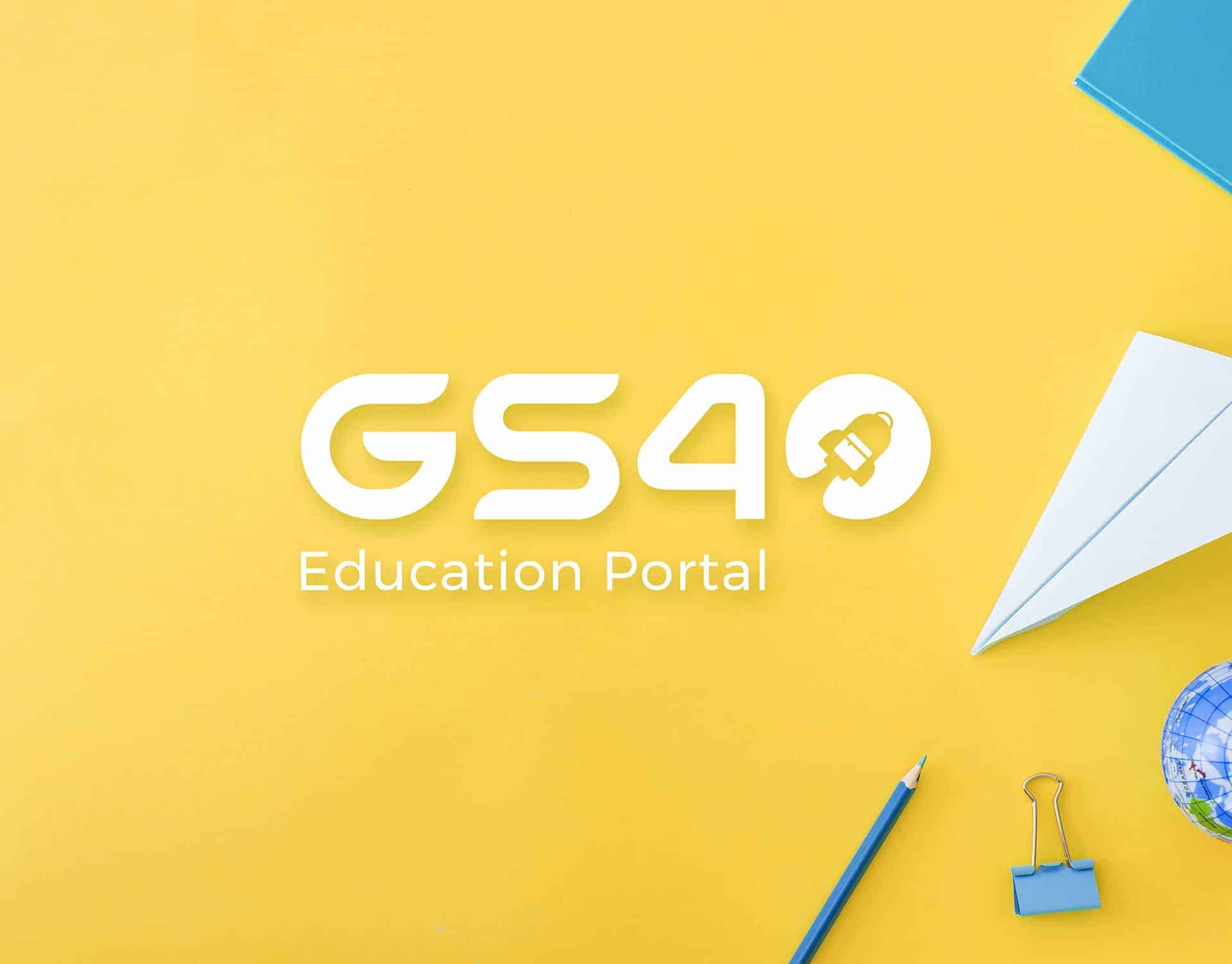
I combine the main elements of the brand's goals to create the logo. Rocket element meaning development fast, powerful and success. The missile also represents Technology Industry 4.0 which the company is aiming for. Backpack element symbolize education - main service of company. 45 degree tilt angle show fast and outstanding development. The logo uses FIFA Welcome Font for GS and Nasalization characters for number 40. Both Typefaces have no footprint to clearly express the modern element, technology in Logo. The use of two typefaces for the Logo creates a harmony between the Letters and Numbers, which is not available in the original typeface. In addition, it is designed to use Montserrat typeface for brand identity to ensure readability, modern and new design.
The meaning in brand colors is described as follows. Blue: A very popular color brings in silence, loyalty and honesty, balanced harmony, trust and reliability. Blue is also the color of success, power and safety. This is the most popular color in Logo design. Most are used for logos related to technology, industry and finance. Grey: Show neutrality, consistency and wisdom. Natural and serene, gray is often used for the use of words in Logo because of its neutrality and ability to combine well with any color.
To complete the project, I use most of Adobe Illustrator and Adobe Photoshop. After meeting customers and conducting brieft analysis, I came up with ideas and concepts. Paper and pencil will be indispensable to list up elements related to the brand, words and symbols. After sketching out as many options as possible, I continued to use paper and pen but through another tool, it was Wacom Bamboo Slate. This is an indispensable tool every time when designing my Logo, it can turn sketches into vectors, which saves me more time and has more ideas when processing in Adobe Illustrator.
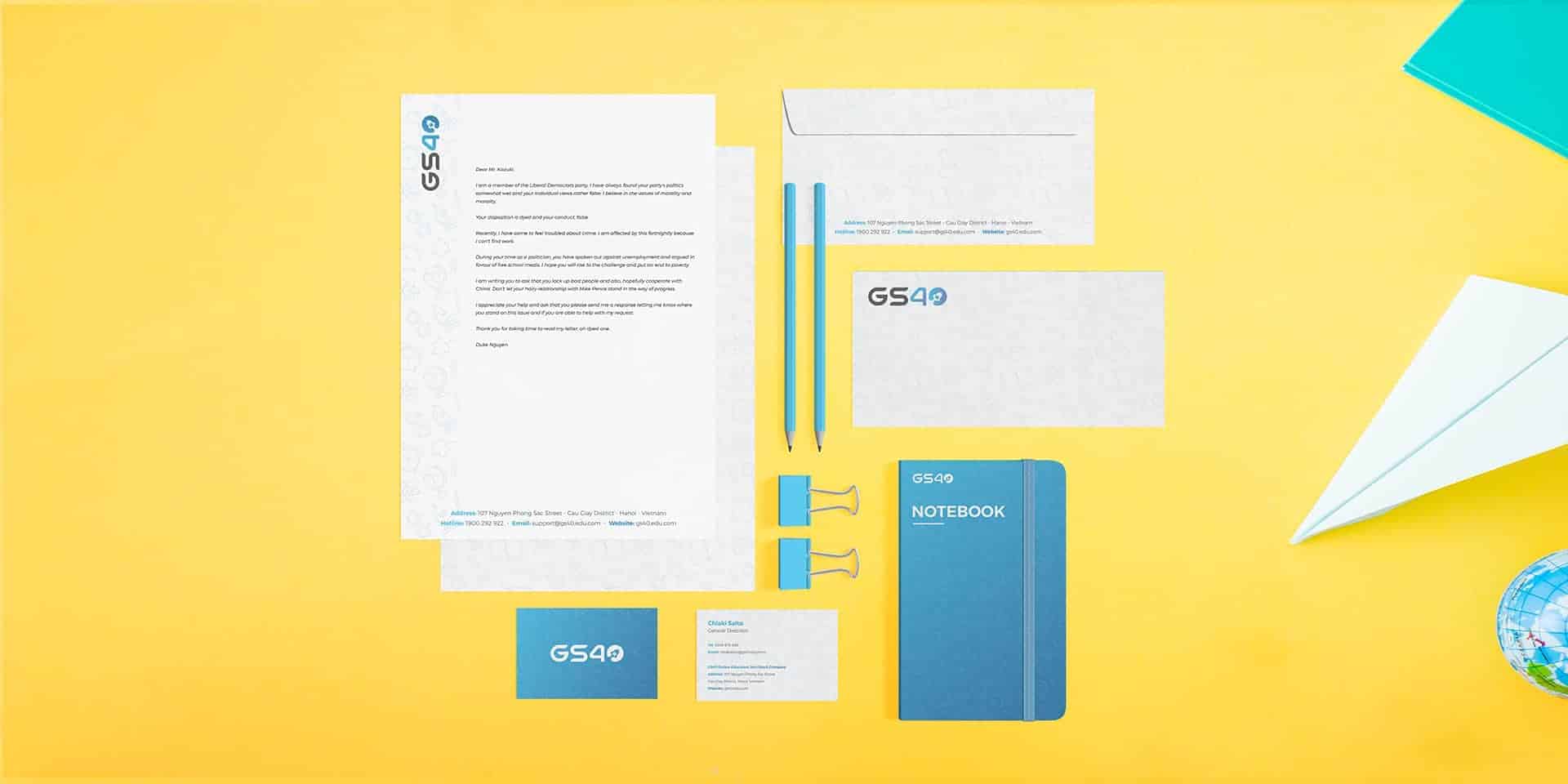
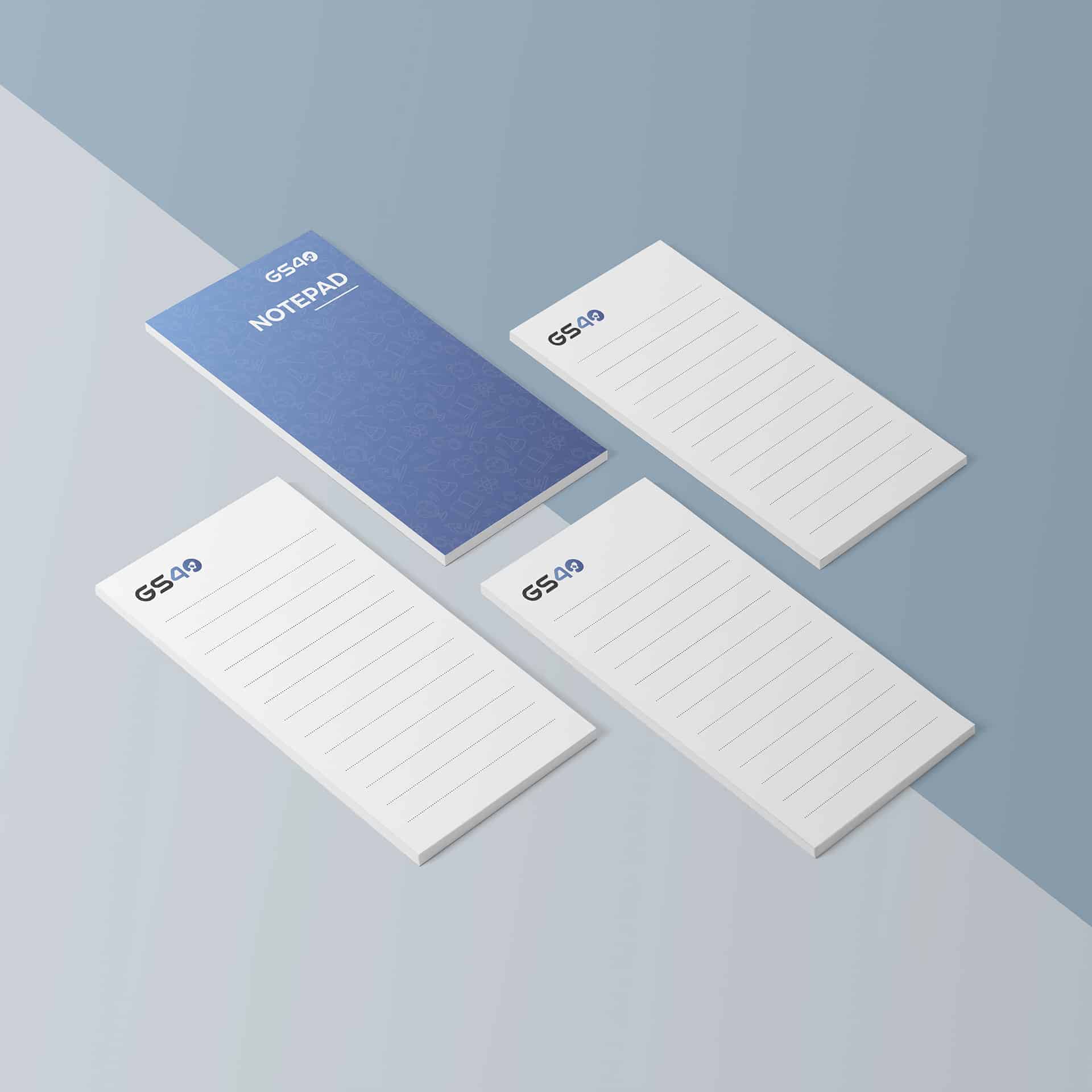
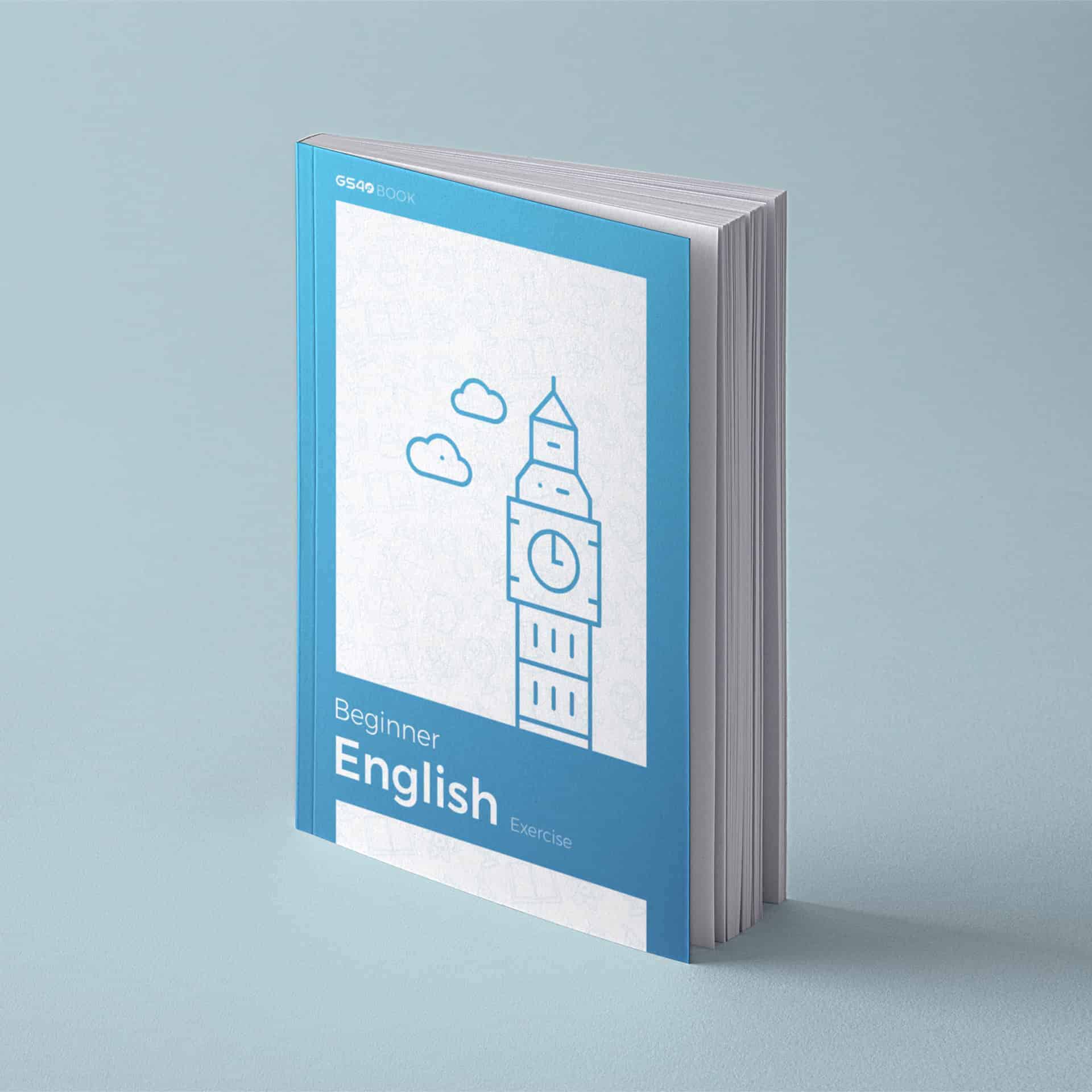
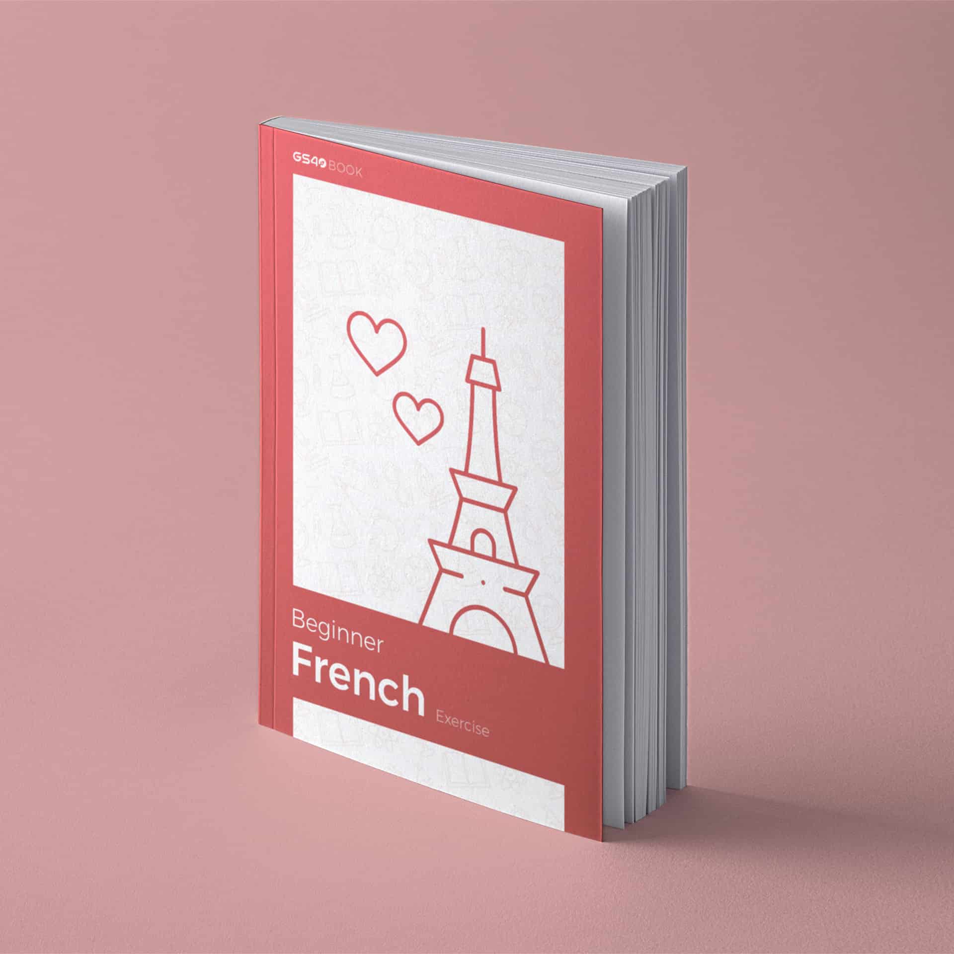
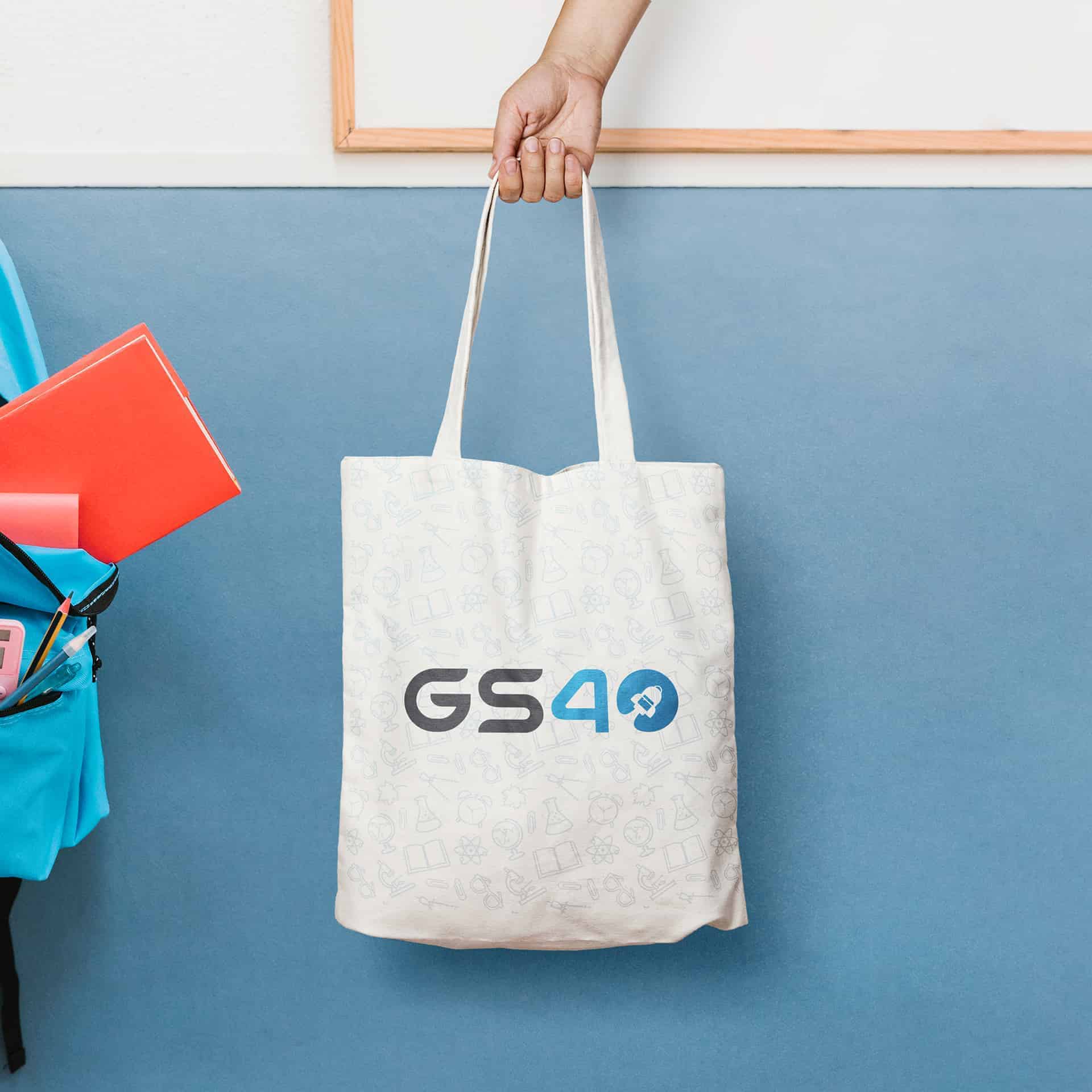
It takes about 3 weeks to design the logo and brand identity, which includes the time to review and revise with customers. You should put the design into mock ups and use mock ups appropriately so that customers can see the project in the most comprehensive and realistic way. I use Adobe Photoshop mainly for this part and image editing.
Upon completion, the project's brand identity is highly appreciated by customers, students and parents. The design has brought users new visual experiences when designing graphic for education segment in Vietnam at the present.
I believe that there will be more such projects in the future to bring new insights into graphic design and education.
Thank you everyone for watching this project. Hopefully this project will be useful and interesting to the graphic design community.
Very nice design. I think a great design like this can bring more attention to an educational site, especially for kids.
I love these, the simple designs are cool!
Thank you so much mate! You made my day