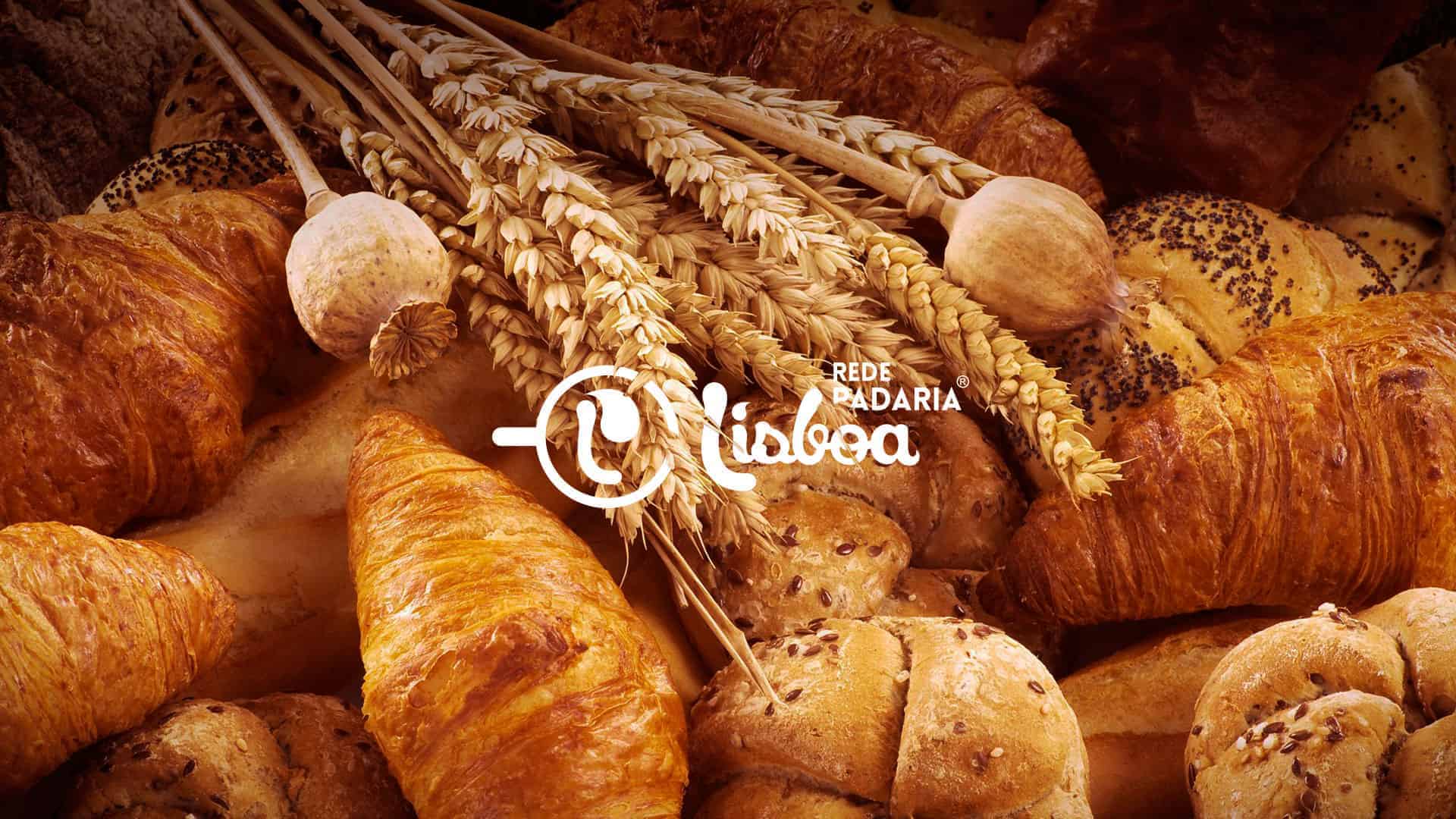
Rede Padaria Lisboa

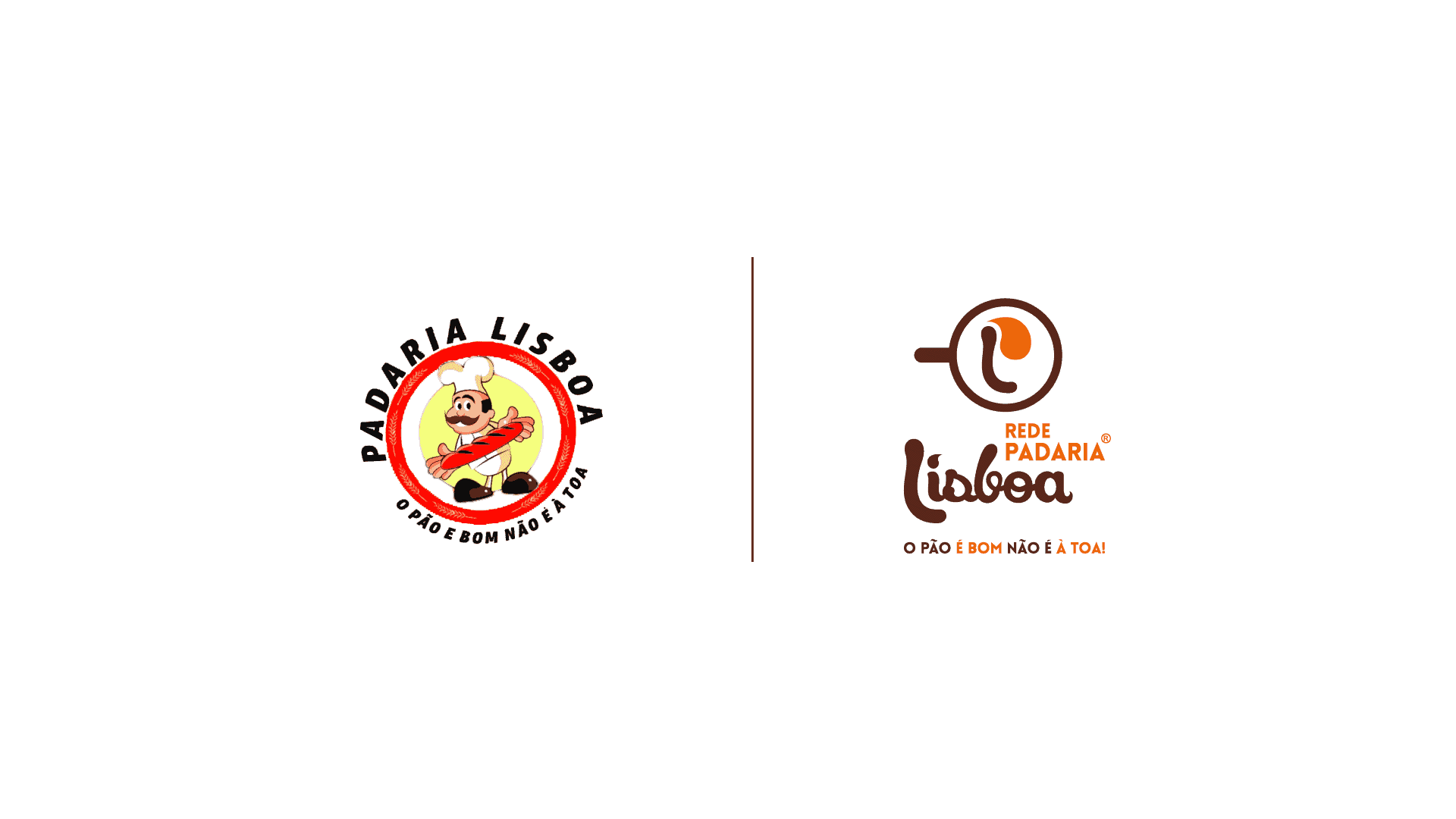
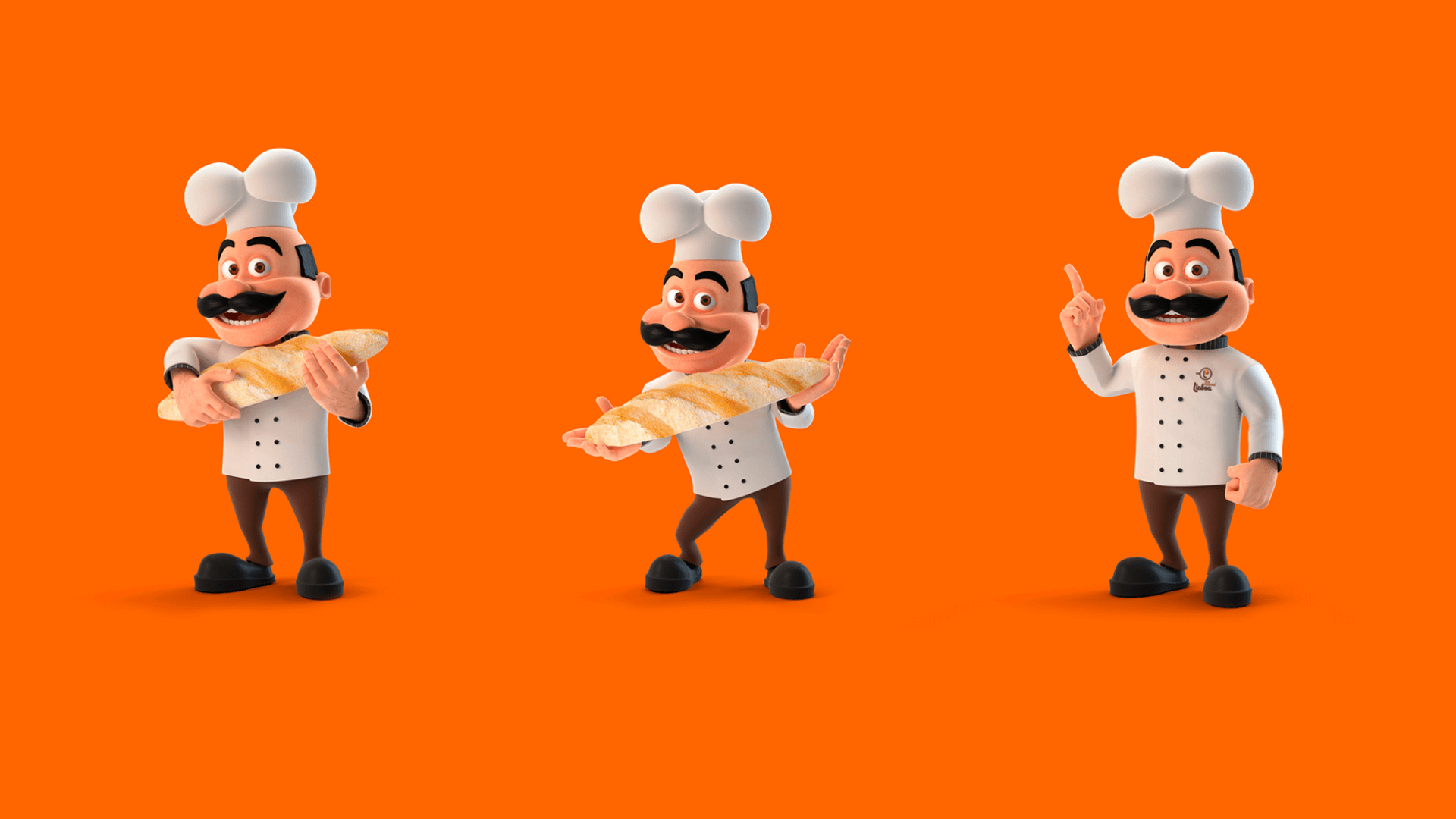
Our mission was to redesign a very traditional brand, with over 20 years on the market and 3 stores at Juiz de Fora city. The brand was old and didn't match anymore the target audience, so we refreshed its visual identity and we kept its essence, which is loving, caring and supporting for what they do.

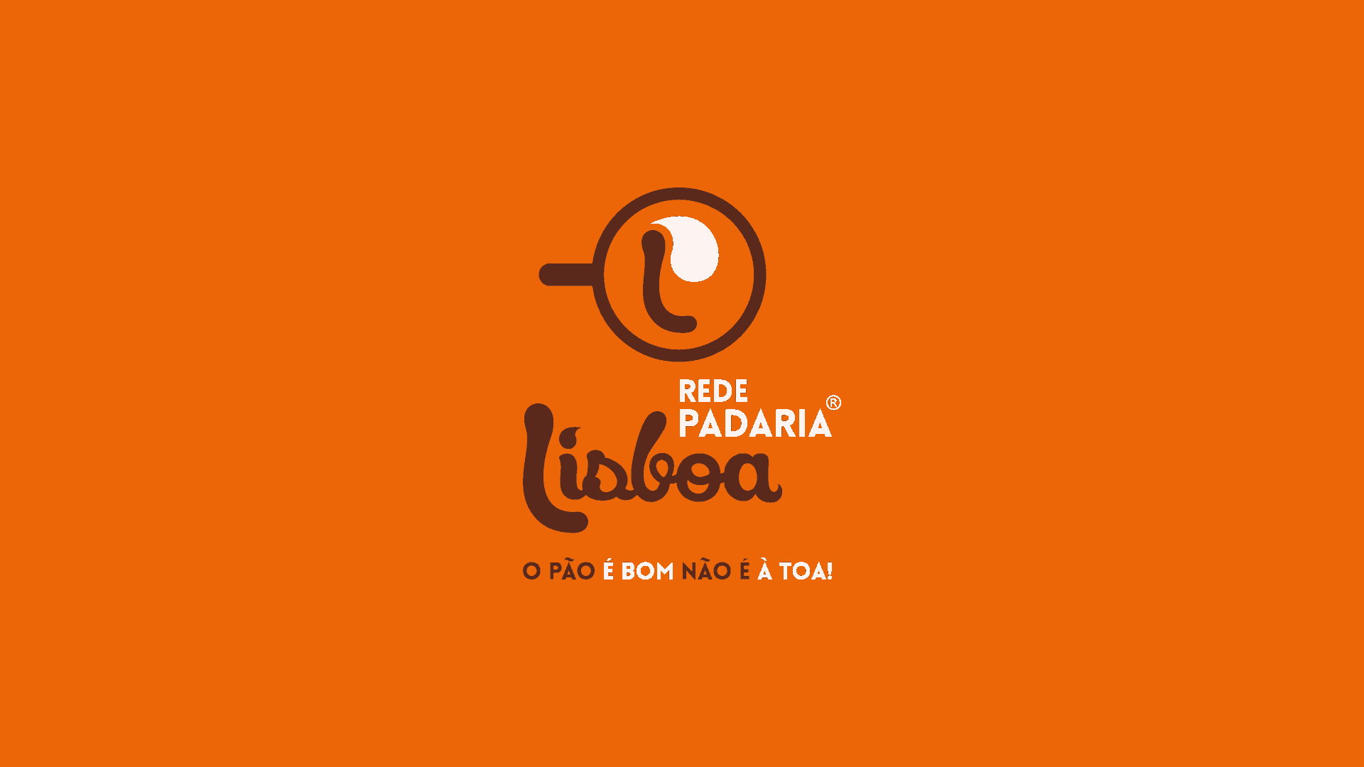
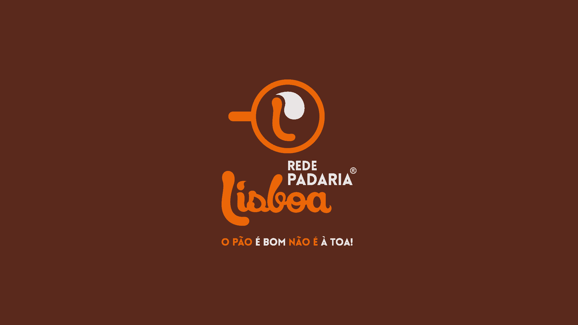
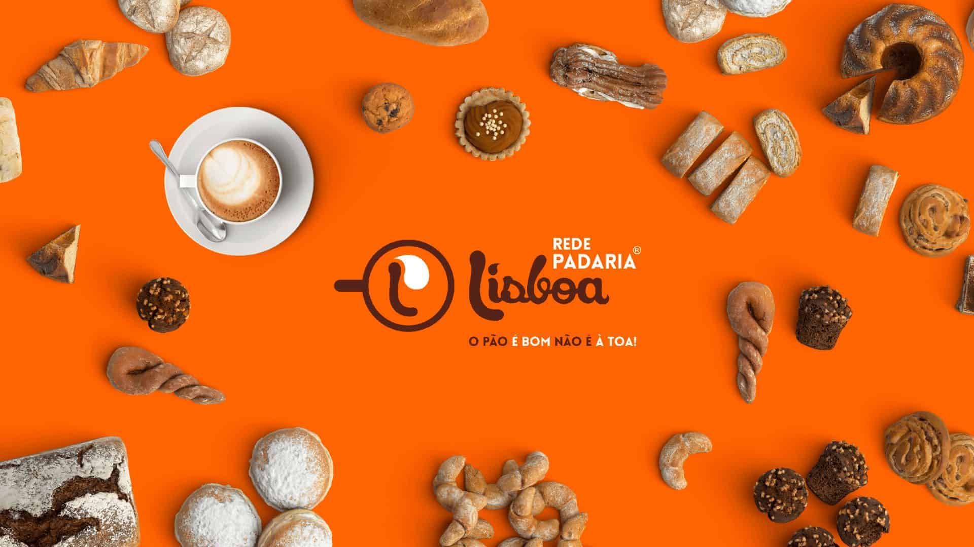
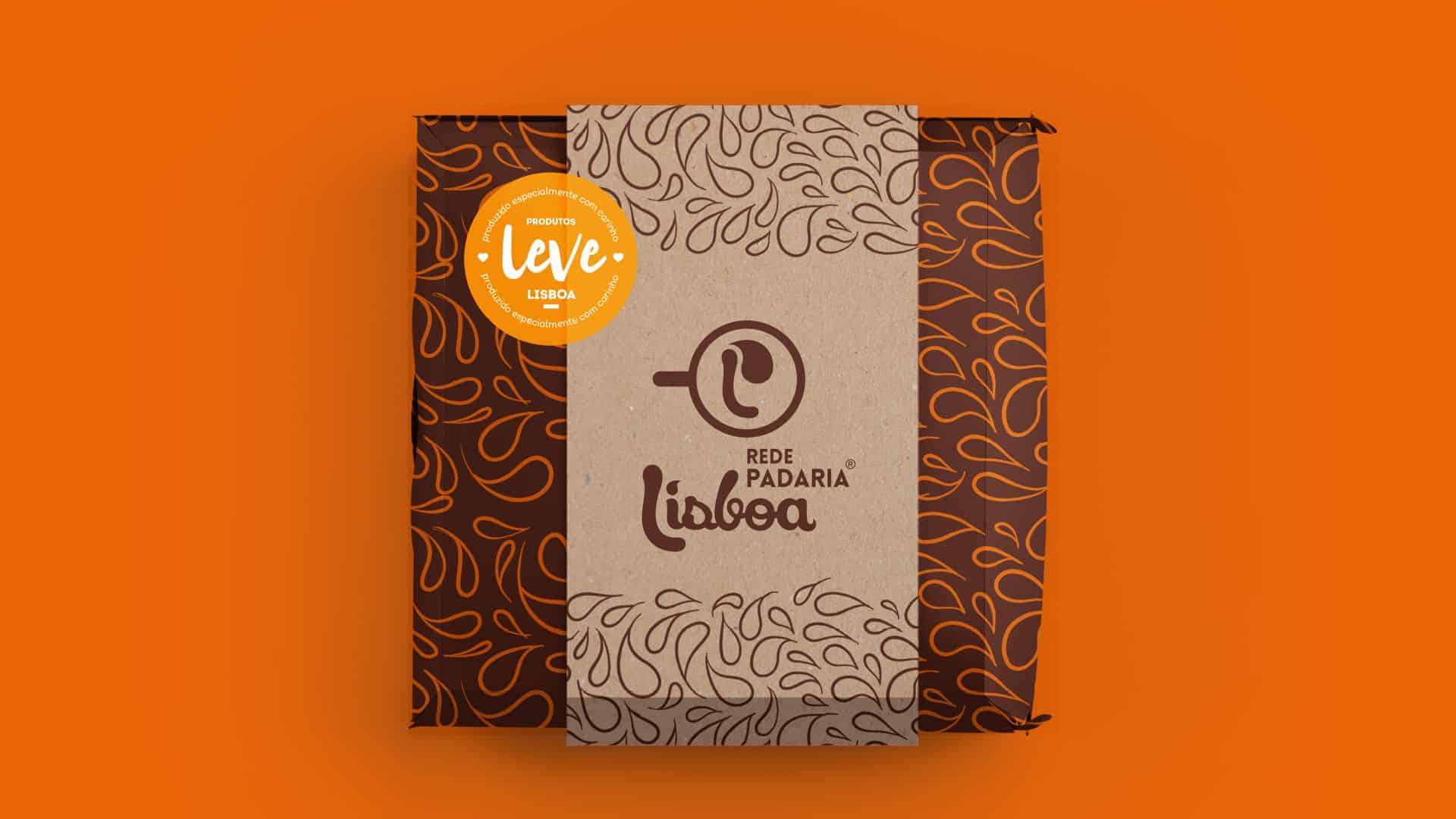
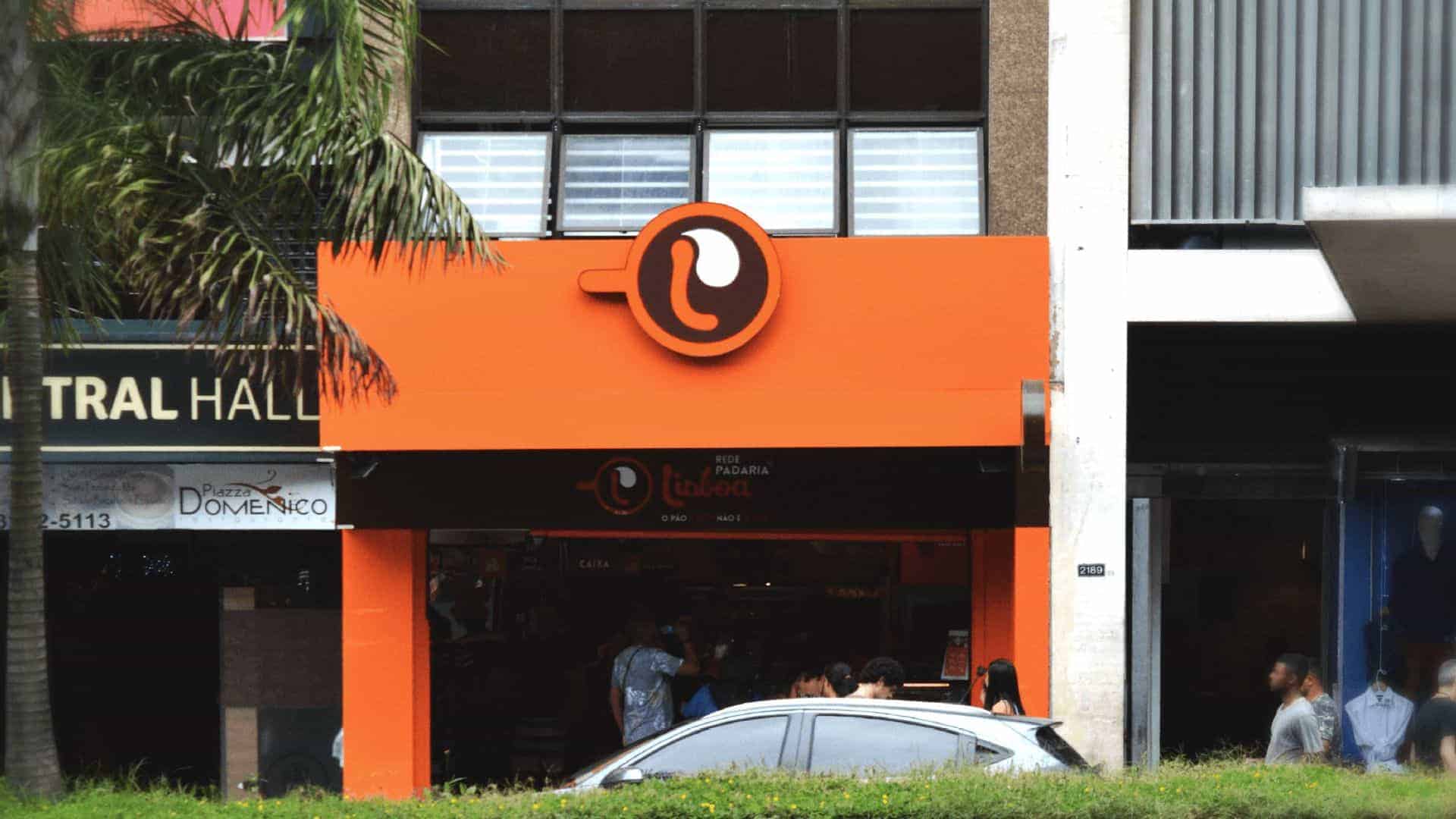
This visual identity project was created from latte art (or coffee art), terms that refer to the drawing done in espressos surfaces. So, the logotype is the result of a graphism that refers to a coffee cup, a splash representing the ingredients of the recipes and the brand's presence in everyday meals, creating the letters "L" and "P", those were resources that reinforces brand's name, making easy memorizing and understanding it.
For this project, we started sketching on paper with the splash idea that builds a shape uniting the initials “L” and “P”, so we went to Adobe Illustrator and finished the logotype. We also used Adobe Photoshop and CorelDRAW for other pieces and designs.
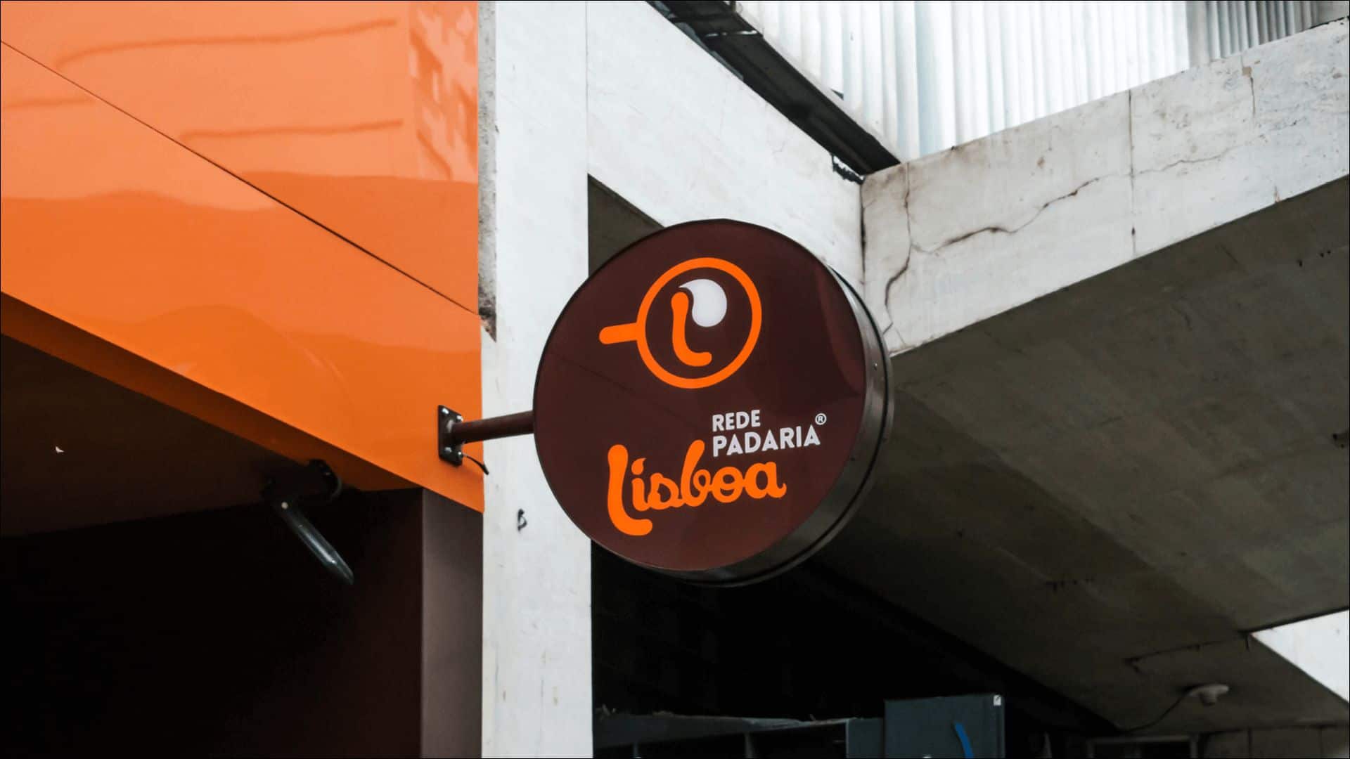
People reacted as positively they could, after the new brand visual identity, with new facades and unity of the stores, the results showed up: the brand got bigger, adding up to 5 stores, beyond that, the brand was recognized as the most reminded brand among Juiz de Fora (Brazil) citizens, in research Top of Minds, by Solar Group. We've learned a lot of branding and marketing strategies, since there are 5 stores by now and we had to handle that.
It looks nice! Great job :)